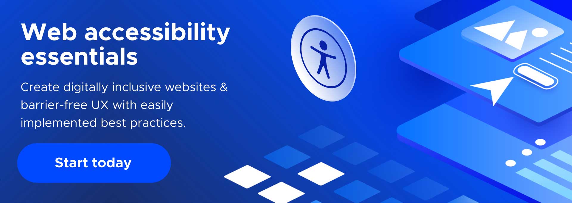
Web Accessibility: Ultimate Guide with Tips, Best Practices, & Checklist

There are over 1 billion people living with disabilities globally and 53 million in the United States. And as the largest minority community worldwide, yes, they too want an equally accessible online experience – also known as surfing the accessible web. Enter web accessibility in the spotlight, delivering critically inclusive user experience (UX). So any online space is an equal and fair playing field for all, giving anyone online the opportunity to enjoy the web, barrier-free.
What is Web Accessibility?
We’re glad you asked.
Regardless of limitations, impairments, or disabilities, everyone deserves and has the right to enjoy being online. We should all be empowered to surf the web, free of bumpy rides, confusion, frustration or issues navigating digital experiences. This is exactly what web accessibility is all about – inclusive, seamless, smooth and enhanced UX.
Adopting web accessibility best practices in digital design and content creation opens your online world up to everyone as fully as possible. You gain a broader audience, better quality sales, more buyers, and increased traffic from improved SEO. And on the flip side, this in turn creates happier loyal shoppers, website visitors, app, and platform users who can’t get enough of what your online space offers. Making it easier, satisfying, and more simple for anyone to engage with your digital space defines web accessibility in a nutshell.
Is it illegal for a website to not be accessible?
While the golden and universal standards for creating an accessible website are set by the WCAG, it’s important to know that digital accessibility is the law. The ADA (Americans with Disabilities Act) declares that any publicly available online space marketing or selling products and/or services must be accessible. Yes, web accessibility is a must-have.
So, newsflash: if your online space isn’t accessible, listen and read on. Because for the greater good of your brand, online presence, audience, sales, and legal standing, it’s worth it – and it’s imperative. The WCAG does a thorough job creating actionable lists and guidelines for all website owners to adopt that we’ll look at in detail, simplifying ADA web compliance.
How do I make my website more accessible?
Most of us have encountered a poor user experience at some point. Some common issues can be clunky website navigation, getting stuck with links that don’t work, or content and visuals that aren’t user-friendly, poorly organized, and hard to understand.
To help you keep your digital experiences ADA compliant, accessible, and thus, inclusive, we’ve created this comprehensive blog post with winning tips, best practices, and a stellar checklist. Your website, app, or platform can get a head start and gain a steadier path to meeting web accessibility standards and laws. Just adopt specific design and development principles before going live, and the retroactive fixes decrease inherently.
We’ll explain how any online experience can transform from engaging to captivating. With better traffic and SEO ranking, improved quality and volume of sales, delivering a fuller UX with inclusion is a legal obligation, and the perks are endless. Plus, we drill down into the various ways web accessibility tools and widgets can make the process of creating inclusive UX faster and easier. With cost-effective AI-powered web accessibility tools, users can gain near-instant access to multiple disability profiles, all at their fingertips.
Remember that all people, including those with disabilities, are critical to consider. So, simplifying their navigation and interaction with websites, apps, or platforms creates a win-win for you and them. Implementing best practices to ensure ADA web compliance and adherence to WCAG standards benefits everyone.
What is a good example of accessibility online?
Features and functionality that make a website, app, or platform accessible to individuals with various disabilities or impairments start with the fundamental layout and design of content. Plus, ease of integration and use with assistive technology, like keyboard navigation, or screen readers sharing the messages of text out loud to people with visual impairments or blindness. Optimizing digital UX with testing, automated assessment, and remediation of accessibility violations is critical when prioritizing inclusion. And AI-powered web accessibility tools can help.
We dig deep into the process, with clear web accessibility examples to help get you on your way. This includes a look at websites of a few leading brands that take digital accessibility to the next level, to core best practices and principles to adopt based on WCAG standards, and more.
But before we get into the nitty gritty of process and implementation of web accessibility best practices, let’s start by understanding the needs of individuals with disabilities. So your digital space can maintain ADA web compliance, while learning how to make a website accessible for users of diverse needs, backgrounds, and various capabilities.
Disability categories: learn how to make your website accessible
People with disabilities have various needs – browsing the web or with any routine errands and activities. Defining and understanding the various types of disabilities can help you identify how to create an accessible website with inclusivity at the heart of your digital space.

Visual – Includes total vision loss, lower levels of vision, and color-related conditions.
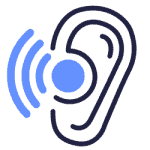
Hearing – Covers the full spectrum of ear-related conditions, including total hearing loss, impaired hearing capacity, and more.

Neurological – Anything related to the central nervous system and peripheral nervous system affecting standard functions that require neurological processing.
Cognitive – Applies to attention-related deficiencies, comprehension disorders, and deduction-based issues.
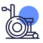
Motor – Relates to motor-control limitations, low-speed muscles, and inoperable hands.
Imagine that tying your shoelaces can be a challenge for someone with any of the above conditions for various reasons. Now imagine one of them trying to use an app, website, or platform that’s not inclusive – unable to see, hear, speak, understand or navigate it with ease. The good news is there are solutions. You can make your digital experiences easier for all of these people with disabilities to navigate, but better yet they can become fun, smooth, and satisfying for anyone.
By implementing a web accessibility tool and creating online content with design and layout that integrates easily with assistive technologies, website, app, and platform owners optimize and enhance UX. Content comprehension, navigation, and interaction becomes a tailor made experience with just a click, voice command, or keyboard stroke. Implementing the right web accessibility solution can help meet web accessibility standards on a budget. Better yet, with the right tool, there’s no reverse-engineering, back-end code, and front-end UX changes required.
Universal web accessibility standards: The WCAG breakdown
The World Wide Web Consortium (W3C) created the Web Content Accessibility Guidelines (WCAG) in 2008. The WCAG establishes universal rules and guidelines to help ensure websites, digital devices, and content are accessible to people with disabilities. Guidelines apply to textual, image-based, and sound-based elements, along with programming language (code) for website accessibility functions and user interface (UI) elements.
How do I know if my website is WCAG compliant?
The W3C launched the Web Content Accessibility Guidelines (WCAG) to ensure digital content is inclusive. You can reference the following information and conformance levels listed below to help ensure your website is WCAG compliant.
The WCAG has seen several updates:
- WCAG 2.0 (2008): Set the initial accessibility benchmarks.
- WCAG 2.1 (2018): Built upon 2.0, adding more guidelines to cater to mobile users and those with cognitive and low vision issues.
- WCAG 2.2 (2023): This latest iteration further refines the guidelines, focusing on the needs of people with cognitive disabilities and ensuring that web content works well with newer assistive technologies.
Remember, while aiming for higher WCAG standards should be the goal, the minimum for many legal requirements is often Level AA.
The three WCAG Success and Conformance Levels are:
- Level A: the baseline level of accessibility compliance. Any site that doesn’t achieve Level A is considered 100% inaccessible.
- Level AA: requires removing commonplace obstacles for those with various disabilities. AA is the top compliance tier needed to eliminate the most significant accessibility hurdles.
- Level AAA: this is WCAG’s accessibility pinnacle, which is more challenging to reach for most company websites. It’s the gold standard for accessibility but not necessarily required.
What are the four principles of web accessibility?
The four key principles to keep your website WCAG compliant are summed up in the acronym POUR – perceivable, operable, understandable, and robust. Understanding them will give you a better sense of how to adhere to them and conform to web accessibility standards and compliance laws.
1. Perceivable
Website information must be easy to perceive with at least one of your end users’ senses. An accessible website implements content in a way that’s simple to understand. Perceivable web accessibility isn’t exclusive to individuals whose vision is not impaired. People with total blindness and lower vision relying on screen readers, text to speech, or braille technologies should be able to access and process your site easily. The bottom line is anyone should be able to comprehend and digest your online space with ease.
2. Operable
An easily operable website means you can click, touch, swipe, or give voice and keyboard commands to whiz through a website, app, or platform. Frictionless access and engagement with the UI of your digital space means no need to jump hurdles. Instead, UX should be smooth, simple, and allow every user to get where they want, and what they want – from all digital experiences.
Functional elements should be seamlessly easy to use – form submission, links, moving through pages, menus, buttons, and so on. Videos should stream easily or have the ability to be paused and/or disabled. Audio should be clear and of superior quality, and content should be impeccably direct and straightforward. These are all critical so assistive tech can integrate and access all aspects of digital spaces with ease. No content, visual, media, or text, should in any way obstruct or hinder user experience of people with disabilities.
Operable, means just that – operating a digital space without headaches.
3. Understandable
Keep it simple and easy to understand – that should be your mantra when it comes to online UX. Are your messages telling users what to do and how to do it clearly? Is the value of images easily understood because alt text is direct, simple, short, and descriptive? And are users easily aware of what you have to offer when reading, hearing, or engaging with your content? If you answered no to even one of these questions, well, your digital space has missed the mark.
Take your digital space a step up and conform to web accessibility guidelines indicating that any text and image-based content should be clear, legible, and in universally accessible language. Think of people with cognitive disabilities, learning disabilities like dyslexia, anyone with hearing impairments using braille displays, or visual impairments using screen readers. If they can’t gain the full value and experience of your site, rethink the content and make it easier to understand.
When a website is inclusive and easy to understand, no one is left behind. Also, be proactive and make your entire website a breeze to process with a logically organized, intuitive, and straightforward structure, design, and navigation. Make it easy to submit forms, check out of carts, click through links, and engage with multimedia content like audio and video. Remember that everyone has their own distinct needs. Understandable means understandable to everyone.
4. Robust
It’s the 21st century, afterall, and technology’s advancements make it difficult to justify the inability to integrate a digital space with assistive technology. The bottom line is, your website content should be digestible, easy to consume, process, and navigate. Whether using a screen reader, voice command, speech to text, or braille display, your content should be simple to interpret and consume by every single user. If it isn’t, go back and try again.
Web accessibility checklist for ADA compliance
Without further ado, here’s our web accessibility checklist to help you accommodate end users, but especially those with disabilities. You can use it as a quick go-to guide to help implement some web accessibility best practices and improve UX.
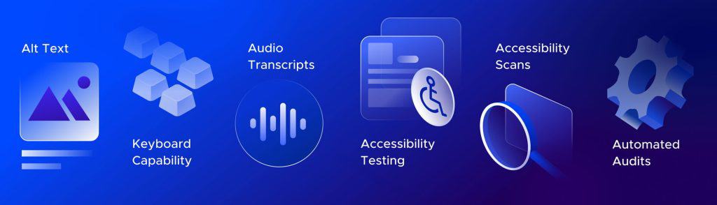
1. Create alt text for website images that’s clear, descriptive & valuable
Screen readers use alt text to read descriptions of images out loud for users with vision impairments, or even those with cognitive disabilities who need clarity. Alt text also helps site visitors identify the context of visuals, especially if images, video, or flash is disabled due to motion sensitivity or slower loading times. Compliant, concise, and straightforward alt text also boosts SEO performance because search engines index the text, driving traffic and sales.
In short, writing quality alt text is absolutely worth the effort. And a powerful web accessibility tool can identify & help you remediate accessibility violations resulting from missing or inadequate alt text.
2. Enable keyboard, screen reader, and voice navigation – assistive tech
We’ve touched on this already, but people with various disabilities will browse online with different types of assistive technology. Using a mouse or conventional tools to navigate digital spaces can be challenging for people with motor disabilities, or even for someone with short-term impairments due to injuries, like a broken wrist, or being post-op for cataract surgery. Empower your users with the ability to navigate your digital space with a keyboard, screen reader, or other assistive technology.
Note: web accessibility tools with multiple user profiles often have built-in assistive tech, and with simple and quick implementation, anyone can engage with your digital experiences with greater ease.
3. Audio and video transcripts plus closed captions for better accessibility
Whether you find it easier to follow the written words of a video, podcast, or audio recording, or prefer reading over listening or viewing multimedia content, transcripts are a good idea. People with hearing impairments can scan the insights you offer, and those with visual impairments might want to use their screen readers over listening to the narrator. Users with conditions like ADHD might also find it easier to reference content at their own pace, using something like a guiding mask tool that highlights content as they read. Transcripts make this possible. Any time.
Closed captions of video content are considered to be a given these days. And you’ll be extending your audience reach of real-time web conferences, virtual meetings, and recordings with captions.
4. Conduct automated accessibility scans & remediate violations faster & smarter
We can’t say this enough, but never take levels of web accessibility standards for granted after meeting them once. The WCAG, as you saw above, updates their guidelines and compliance standards in timely increments based on tech advancements and developments. Since most websites, apps, or platforms can undergo frequent updates and changes to content, it’s a smart and strategic move to consistently monitor and scan your digital space for accessibility compliance.
Automated accessibility scans and remediation of some violations can be prescheduled, providing invaluable peace of mind for companies on a legal level, while optimizing UX.
5. Integrate automated audits and blend with manual ones
AI-powered web accessibility widgets can identify digital compliance and accessibility issues requiring remediation in real time. Automation and AI-powered auditing blended with manual audits is not only a best practice to ensure an accessible website, it’ll help keep digital accessibility levels at their peak. Mixing the best of mind and machine means reducing human errors and overlooked mishaps that can amount to costly legal issues. But most importantly, it’ll keep your digital space and experiences inclusive for everyone.
6. Color contrast, zoom, and legible fonts and text size
Needless to say, squinting, abrasive visuals with colors that clash or make it tricky to make out text, itty bitty font size and style make it difficult to read and engage with digital spaces. Don’t do it. Make sure your website’s color contrast levels are sufficient, sleek, and support delivery of messages. But also, give users a chance to see and read everything clearly.
WCAG guidelines indicate websites should deliver 200% zoom capacity. Make it happen with simple integration of technology and coding that makes reading, learning, and understanding your website fun and simple. Zooming in and out isn’t a complicated process for users with assistive technology, nor the conventional way. And it’s quite easily enabled on websites, apps, and platforms.
7. Form submission: reduce bounce rates, increase sales and satisfaction
We can’t say this enough, but seriously, make forms easy to submit. Don’t send users around on a wild goose chase for what to fill in, which button to click, and complex completion of forms. If you can enable autofill options to integrate with your digital space, do it. That’s why people save their personal data on smartphones – saving time and hassles.
The obvious reason that simple form completion is a benefit is it keeps users and buyers happy. But the even more obvious one is to generate legit, high quality, fruitful, and productive business. Whether meant to generate leads, convert clients, or send queries to your help desk, forms should be easy to finalize and submit. Make buttons easy to identify, dropdown menus simple to click through, and keep it simple so the process is smooth.
How do I start accessibility testing for my website, app, or platform?
Testing web accessibility for people with disabilities is a commonly adopted best practice to help identify levels of ADA web compliance. Use an isolated and consistent test group that represents a spectrum of disabilities – from vision, to hearing, cognitive, and motor impairments, to users with learning disabilities or second language speakers.
This way, you not only can gain a sense of how well your site meets web accessibility standards and requirements, but you also acquire solid feedback about their interaction with your digital experiences.
Ensure you accommodate all of the testers by ensuring the testing environment meets the diverse needs of their condition or disability. And for heaven’s sake, take their insight seriously. These are people dedicating their time to give you a concrete, constructive, and insightful understanding of how well you deliver inclusion to your audience. In other words, if you want to truly convert visitors into returning readers, browsing “window” shoppers into buyers, or interested leads into subscribers, take their feedback seriously. And then, implement changes.
Another word to the wise: don’t take for granted that once you think you’ve addressed an issue or concern that’s raised by a tester, your UX is up to par and spot on. Ask testers to come back to the issue they identified and verify that you’ve tackled the problem after remediating.
Web accessibility examples: a few websites worth highlighting
We scoured the web, searching high and low for some of the best and winning examples of web accessibility online today. Here are a few prime web accessibility examples worth reading about and learning from, regardless of your industry or niche. Take the approach and concept, and adapt it to your target audience, needs, and make magic happen.
Eventbrite: planning your shindig is inclusive and easy
We all host events that we want to turn out just right. And making the digital planning and RSVP process simple, easy, engaging, and sleek are an added bonus Evenbrite delivers.
You can custom and handpick options that work for your happening, or skip over options that don’t. The web accessibility perk is that users with a visual or cognitive disability don’t have to get stuck on options that would create hurdles for attendance numbers. Plus, fun design, sleek layout, and a simple, easy to navigate UI are all advantages when building an event in Eventbrite. Kudos.
Patagonia: the great outdoors in style and inclusive UX
Yes, we all know them for spiffy outdoor gear, but Patagonia does a pretty exceptional job with their website’s accessibility. With easy to navigate web pages organized with clear, intuitive, and logical structure, the brand’s website makes it easy to check out products based on geographical zones, or much coveted items on your shopping list with distinct categories.
Plus, forms are simple to submit and coded well, and source code is loaded with ARIA tags. Adequate color contrast of UI, inclusion of alt text, and stellar design make for great UX. Lastly, they astutely include an accessibility statement in the website footer.
BMW: Take a ride on the web accessibility side
For anyone with vision or cognitive impairments and/or disabilities, BMW isn’t just a sweet ride on the road. On their homepage, users are empowered to choose if scrolling content is paused or runs, minimizing distractions and maximizing UX. WCAG guidelines clearly indicate the animation or video should be able to pause, stop or be hidden, so hats off to them for a great vehicle and online experience.
Legal implications of inaccessibility & how to avoid them
While the ADA doesn’t explicitly call out web accessibility requirements, federal courts and agencies have established a solid legal precedent.
In 2020, 3,500 cases were filed against companies that didn’t meet web accessibility standards, with 74% of claims filed against organizations with eCommerce storefronts. From SMBs to large-scale operations, companies of all sizes could be at risk for web accessibility lawsuits. And smaller organizations with fewer resources often feel the greatest impact of legal implications, and are seemingly more easily targeted by plaintiffs.
Is WCAG a legal requirement in the US?
The direct answer is no. But as mentioned earlier in this blog post, WCAG is not a law. It’s a golden, universal standard of guidelines to help conform to web accessibility compliance laws. The law itself for accessibility digital experiences is stated in the ADA. With that, if you don’t abide by WCAG guidelines, you could easily be setting yourself up for legal concerns faster than you can say “web accessibility.”
Web accessibility: much more than a wise business strategy
Listen, if it isn’t already obvious, web accessibility amounts to much more than user inclusion – it’s a business tactic that heightens success on every level. ADA web compliance increases sales bottom line for all products and services marketed online, but especially for eCommerce storefronts. Let’s shed some more light on this note with these statistics:
- E-commerce sales in the US reached roughly $5.2 trillion in 2021 and they’re projected to reach $8.1 trillion by 2026
- 93% of users want eCommerce shopping experiences to outshine in-store buying
- 52% will pay more, (yes, more), to locate what they want with a few clicks
Making your website more accessible with cost-effective technology that’s user and budget-friendly can be easier than you think. Your dev team doesn’t have to invest hours of coding and painstaking effort to maintain digital accessibility compliance. Quick, simple, easy, and automated fixes with the help of AI can empower you with a website that’s edgy, sleek, fun, engaging, and easy to use for anyone.
Web accessibility helps everyone
If your website’s inclusive, you’ve kind of got in made, because it means no matter the user or their scenario, you’ve met their digital and user experience needs. Take the color contrast or brightness adjustment tool on your phone. Sure it simplifies reading and understanding content for people with vision impairments or disabilities, and likewise with zoom capacity. But it also helps an app user desperate to order a product or even pharmaceuticals online on a sunny day. The glare of strong light can make it taxing to read on smartphones. Adjust the screen settings and problem solved.
What about voice command or voice to text technology? Overcoming challenges that come with situational disabilities becomes easier and faster with a touchscreen, like someone recovering from a broken arm or finger. We’re in an age when we can tell our phones what to do, what to find for us online, offline, turn on the lights, then turn them off, play music, or verify statistics. Perhaps not wash our dishes, but, at this pace we could be inching closer.
Despite voice command being initially designed for people with motor impairments, it’s become an equally useful, powerful, and important tool to any online user. Convenience sells, and inclusion drives convenience and comfort.
Consider how anyone recovering from cataract surgery for up to 10 weeks can benefit from the use of a screen reader as it dictates the content of a webpage. And for someone, who needs to address an urgent message from their children at school, it might just be easier to hear those messages with a screen reader, than try to read and discern them under pressure. Friendly reminder: screen readers were designed for people with visual impairments or disabilities. And yet, again, they help us in so many ways and different scenarios.
UserWay to the rescue: enter web accessibility at its finest
UserWay’s mission is to deliver inclusive, accessible digital experiences with ADA compliant websites in mere moments. Our widget is downloaded, installed, and loved by millions of website, app, and platform owners. And their users benefit from a plethora of disability profiles with innovative features that truly simplify and enhance UX. With easy integration, minimal code required, and AI-powered automation, web accessibility redefines online interactivity. Now, ADA web compliance is faster, smarter, and more simple than ever before.
Ready to get started?
Answers to Common FAQs
Why is Web Accessibility Important?
An accessible website simplifies user experience for people with disabilities, helping ensure inclusion and consideration of the diverse backgrounds and needs of website visitors. Meeting web accessibility standards of the ADA and the WCAG also ensures your site is legally compliant, helping your organization avoid costly, unnecessary legal issues. Creating an accessible website ultimately enhances your online sales performance, particularly for organizations in the eCommerce niche.
What Features Make a Website Accessible?
With an AI-powered web accessibility solution, organizations can more readily meet ADA compliance guidelines with features like alt text, contrasting font, audio transcriptions, keyboard navigation, intuitive design and UI pathways. Plus running regular scans and audits will help maintain an accessible website.
Who Benefits from Web Accessibility?
Web accessibility inherently improves user experience for everyone, creating a win-win situation for both organizations and site visitors, particularly online users with disabilities. With inclusive design and content layout, companies simplify site navigation and drive seamless user interactivity, increasing engagement and sales bottom line.


Share