Image ALT Text: Best Practices, Examples & SEO
The internet is a treasure trove of information, buzzing with visuals that spice up our browsing experience. Yet, it’s easy to forget that not everyone experiences the web in the same way. For people with visual impairments, a vibrant image can be a blank space without the help of image alt text.
Image alt text is the behind-the-scenes feature of web accessibility, providing a contextual alternative to visuals on the web. It gives meaning to visuals for users who rely on assistive tech like screen readers or braille displays so everyone gets the full story. It’s a small step that makes the web more inclusive, ensuring everyone can share in the wealth of knowledge and engagement online.
In this blog, we’ll dive into everything alt text, from its core definition in HTML to its pivotal role in SEO, covering image alt attributes, best practices, and even how to craft alt text for different types of images to make sure your content is accessible for all users.
What is Alt Text in HTML?
Alt text is the commonly used abbreviated form of the term “alternative text.” This is the descriptive text included in a website’s foundational Hypertext Markup Language (HTML) code (the code that builds your entire website structure and navigation), describing an image on a webpage.
Alt text can also be referred to as “img alt attributes” or “img alt tags.” You might be wondering, “so what exactly is an img alt attribute or an img alt tag?” This is text that provides context for people who use screen readers and other assistive technology, accurately, concisely, and clearly defining what is in an image and its purpose within the text.
What is Alt Text for Images?
Alt text for images or alt text in HTML is a concise description that provides context and conveys the content and purpose of an image on websites and digital media. It’s essential for accessibility, helping visually impaired users understand the image content via screen readers, and it also plays a significant role in improving a website’s SEO.
Why should you use Alt text for images?
Alt text, short for alternative text, plays a vital role in web accessibility. It’s like giving a voice to your images so that everyone, including those who use screen readers due to visual impairments, can get the gist of what’s being shown. Here’s why it’s a good idea:
1. Accessibility: This is the big one. Alt text helps visually impaired users understand an image’s content and function. It’s like having a helpful friend whispering what’s going on in the picture.
2. SEO benefits: Search engines are smart, but not quite smart enough to fully decipher images. Alt text helps them understand what the image is about, which can boost your content in search results.
3. Technical troubleshooting: Ever had an image fail to load? We’ve all been there, staring at a blank box where a picture should be. Alt text provides a textual snapshot of the missing image, so users know what they’re missing out on.
In a nutshell, using alt text is a simple step that makes your content more inclusive, boosts your visibility in search results, and provides a backup description when images don’t load. It’s a small effort with big benefits. Why wouldn’t you use it?
Unfortunately, many businesses are not fully utilizing alt text, or, if they are, the alt text for images is not being written well. Let’s look at two examples to clarify: one demonstrating effective alt text and another illustrating what to avoid.
What is an example of good alt text?
Picture this: an image of a playful kitten chasing a rolling ball. An effective alt text for this image could be:
“Orange kitten playfully chasing a blue ball across a green carpet.”
Here’s the breakdown of why this alt text is helpful:
1. It’s descriptive: It clearly describes what’s happening in the image, painting a vivid picture for those who can’t see it.
2. It’s concise: It gets to the point without rambling on. Brevity is key.
3. It’s contextual: It provides the necessary details (like colors and action) that give context to the image in relation to the surrounding content.
By using this type of alt text, you’re not only making your content accessible but also adding a layer of detail that enriches the user experience.
What is an example of bad alt text?
Bad alt text can be quite a misstep, turning what’s meant to be helpful into something frustratingly vague. Let’s stick to the image of our playful kitten. Here’s an example of what not to write:
“Image” or “Picture”
Why is this bad? Let’s break it down:
1. It’s too vague: Saying just “Image” or “Picture” is like telling someone you’re eating food when they ask what’s for dinner. It doesn’t provide any context or useful information about what the image contains.
2. It misses the purpose: The whole point of alt text is to convey the essence of the image to those who can’t see it. “Image” tells them nothing about the playful kitten or its antics, which is a big opportunity missed.
3. It does nothing for accessibility: For users relying on screen readers, this kind of alt text is a roadblock, not an aid. They’ll know there’s an image, but they won’t have any clue what it’s about, which can be pretty alienating.
In short, alt text like “Image” is like a chef saying “It’s food” when asked what they’re serving. It’s technically true but far from helpful or informative! Always aim for clarity and context to make your alt text genuinely useful.
Next up, we’re going to visually showcase a range of image types with examples of both good and bad alt text. This will help paint a clearer picture for you, illustrating how to effectively describe different kinds of images and common pitfalls to avoid. Stay tuned to get a deeper understanding!
Do’s & don’ts of crafting alt text for images
Let’s explore the art of crafting effective alt text across various types of images, a huge skill for any digital content creator. In this section, we’ll explore tailored strategies for different image categories, ensuring your alt text enhances accessibility, enriches user experience, and bolsters your content’s SEO value.
Informative Images
When it comes to informative images, your alt text needs to strike the perfect balance between brevity and detail to effectively convey the image’s message.
Do: Aim for precision and clarity in your descriptions, ensuring they encapsulate the key points the image communicates. Remember, the right alt text can turn a mere picture into a narrative, enriching the user’s experience and understanding, especially for those depending on assistive technologies.
Don’t: Overlook the depth and context of your informative images by resorting to vague or non-specific alt text. Such oversights can dilute the image’s purpose, leaving users guessing rather than understanding.
Did you know? Neglecting detailed alt text for informative visuals can result in a missed opportunity to engage and educate your audience, potentially diminishing the value of your content and affecting user engagement.
Alt text examples:
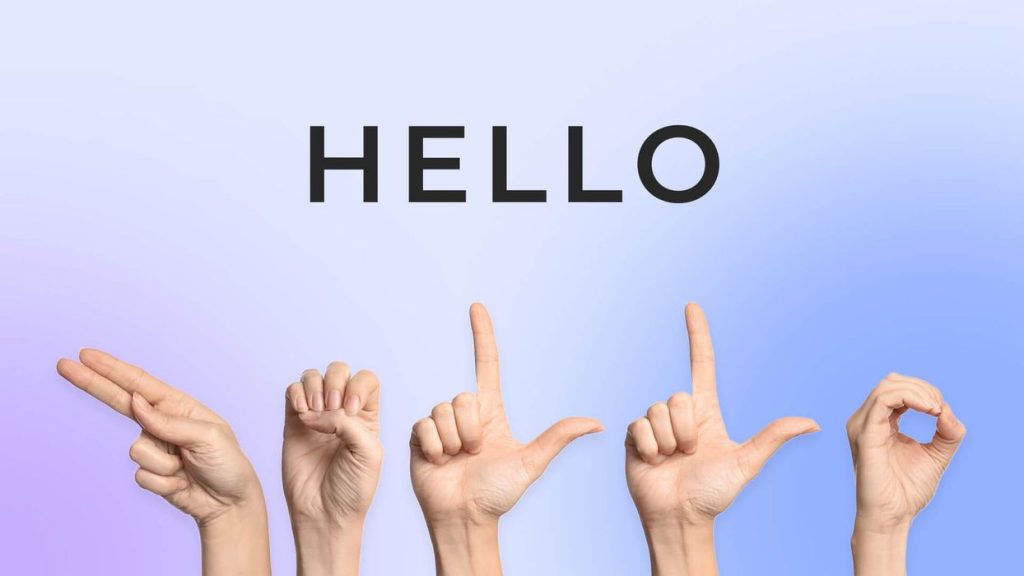
When discussing how people with hearing impairments use sign language, an image showing the sign for “hello” can deeply enhance comprehension. Effective alt text for this image ensures that even those with visual or cognitive impairments grasp the significance and practicality of sign language.
Decorative Images
Decorative images should complement your content without needing detailed alt text. Striking the right balance ensures these visuals enhance the aesthetic without confusing the purpose.
Do: Use a null alt attribute (alt=””) for images that serve purely decorative functions, ensuring they don’t distract screen readers from more critical content.
Don’t: Assign elaborate alt text to decorative images. This can overwhelm users with unnecessary details and detract from the content’s core message.
Did you know? Excessive descriptions for decorative elements can clutter the user experience, obscuring the vital content and diluting overall engagement.
Alt text examples:
Not good: It’s not advisable to insert any description in the alt text for decorative images; anything other than a null entry is excessive.
Good The appropriate way to handle alt text for decorative images is to set it as “null,” like so:<img alt=””>
This approach ensures that screen readers bypass the image, saving users’ time by not announcing irrelevant content.
Functional Images
Functional images are integral to user interaction and navigation, requiring alt text that defines their purpose or action clearly.
Do: Provide descriptive alt text that elucidates the function of the image, such as “Search button” or “Home link,” facilitating better navigation for all users.
Don’t: Be vague or irrelevant in your alt text for functional images, as this can lead to confusion and hinder usability.
Did you know? Inaccurate or unclear alt text for functional elements can frustrate users, especially those relying on assistive devices, potentially driving them away from your site.
Alt text examples:
![]()
Not good: A floppy disc.
Good: Save button.
Images of Text
Whenever possible, avoid using images of text. If necessary, ensure the alt text meticulously transcribes the text within the image.
Do: Accurately transcribe any text presented in the image, making the information accessible to all users, particularly those using screen readers.
Don’t: Use images of text without providing a precise and complete transcription in the alt text, as this can exclude users from accessing critical information.
Did you know? Failing to provide accurate alt text for images of text can create barriers for users with visual impairments, undermining the inclusivity of your content. Transcribing the text in images helps maintain content accessibility, allowing screen reader users to access the same information as everyone else.
Alt text examples:
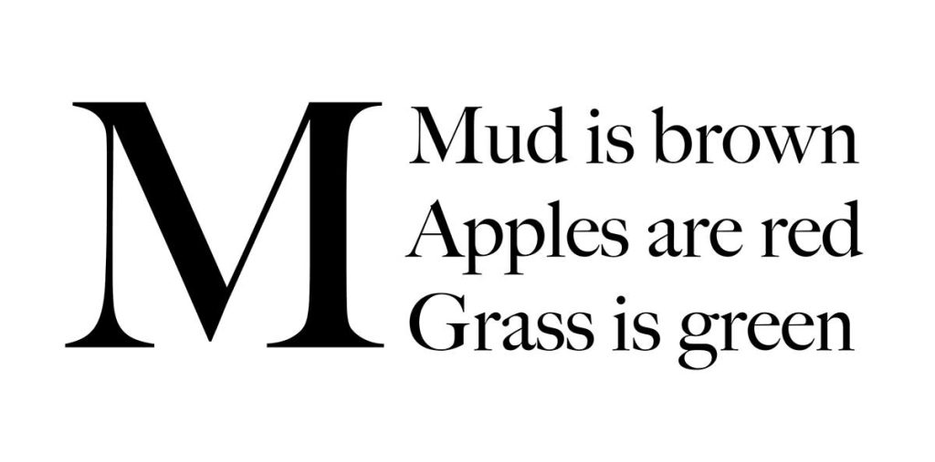
Not Good: Including this type of image at all. But if it has to be in the content, then poor practice would be alternative text that reads, “this image has text that reads {text here]”
Good: Replicating the exact written content of the words in the image – “Mud is brown, apples are red, grass is green.”
Complex Images
Complex images like graphs or detailed illustrations demand comprehensive alt text that conveys the essential information they contain.
Do: Craft detailed and informative alt text that breaks down the crucial elements and data depicted in the complex image, aiding user understanding.
Don’t: Oversimplify or neglect the complexity in your alt text for such images, as this can result in a loss of critical information for the user.
Did you know? Skimping on details in alt text for complex images can leave out vital information, preventing users from fully grasping the intended message or data.
Alt text examples:
When using an infographic or diagram in educational materials to illustrate an idea, it’s crucial to summarize its key insights in the alt text. This helps contextualize its relevance within the content. Include any text from the infographic in the alt text, adhering to the 125-character guideline where feasible, without compromising the accuracy of the depicted information.
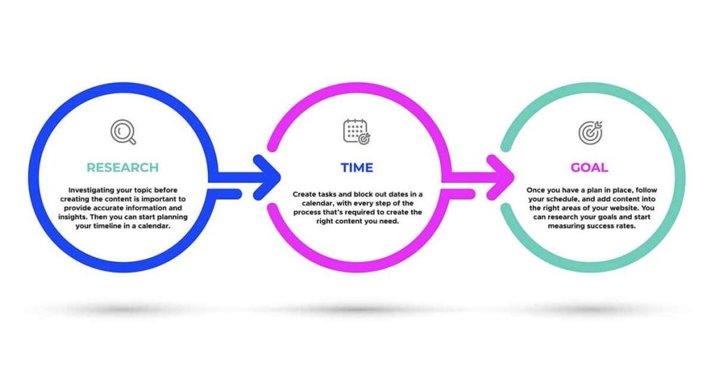
Not Good: infographic including tips for content
Good: Reaching website content goals and measuring success requires research and time management.
Groups of Images
When images are used collectively to convey a message or tell a story, each piece’s alt text should contribute to the overall narrative or information being shared.
Do: Ensure each image’s alt text in the group adds to the collective understanding or story, providing context and enhancing the content’s coherence.
Don’t: Isolate each image’s alt text without considering its role in the group, as this can disrupt the narrative flow or informational clarity.
Did you know? Cohesive alt text across a series of images can significantly enhance the storytelling or informational value for all users, especially those using assistive technologies.
Alt text examples:
If we are looking at a series of images about bears in the wild, their survival skills, the relationship between mother and cub, and how they hunt, creating a brief, precise description of what the images convey overall in adding alt text to images is what’s required.


Not Good: Bears in the wild.
Good: A mother bear protects her cubs walking in the forest, hunting for food, and crawling on trees in their natural habitat.
Image Maps
With multiple clickable areas, image maps should be described with a group alt text that gives the overall context of the map. Any clickable area should also have its own individual alternative text that describes the destination of the link and its purpose.
If you’re unsure whether an image falls into one of these categories, check out W3C’s Alt Decision Tree to help you decide.
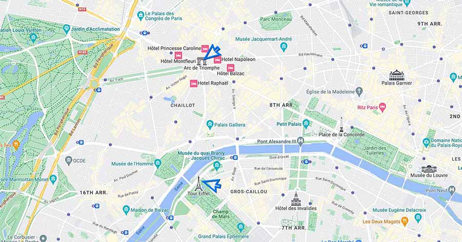
Not Good: Map of (city/location)
Good: A map of Paris marking various landmarks and vendors, including The Arc de Triomphe and Eiffel Tower.
While we’ve focused on the accessibility and user experience aspects of alt text, it’s time to shift gears and explore another benefit: SEO and your online visibility.
SEO matters: how adding alt text to images boosts your visibility
Using alt text in SEO can be a strategic business move to elevate your website’s visibility and ensure your images contribute positively to your search engine ranking.
Go online and search “examples of pie charts” in Google.
These are the results you’ll see:
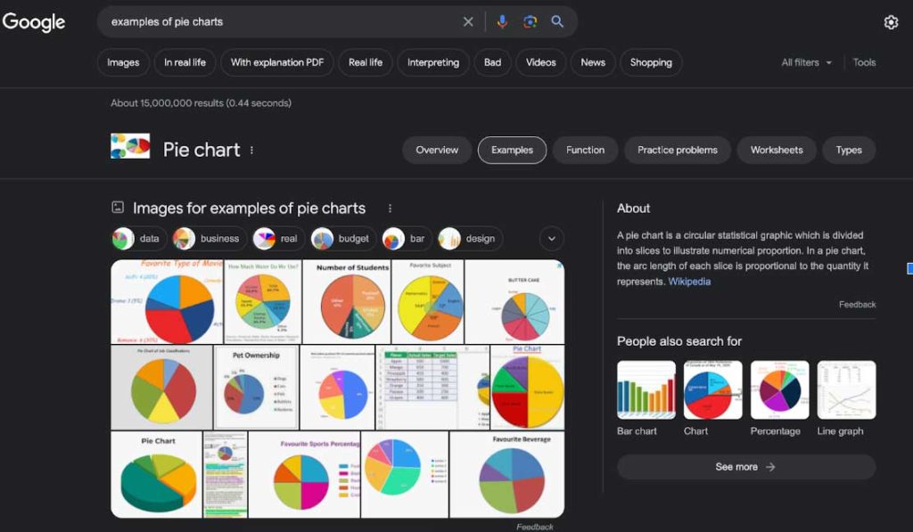
Google’s initial response to the keyword search generates a collection of thumbnail images you can click, even prior to presenting any organic content related to the search. The thumbnail images are visible as the first option on the Google SERP (Search Engine Results Page) before any organic text in search results by strategically adding alt text to images. Sources indicate that image thumbnails show up in about 40% of desktop SERPs and 65% of mobile SERPs. That’s a heavy load of traffic that could come to your website, and it could lead to measurable developments, like conversions, leads, and increased engagement.
What’s the point? Your SEO will directly benefit from alternative text for images. Google crawlers scan the web searching for keywords in queries. Always consider what your online users might be looking for online. If for example, your user is looking at “examples of pie charts,” maybe the actual visual and image thumbnail will be a better indicator of what would be ideal and expected.
If someone was to inquire about “how to make a pie chart,” likely they would want to see a screenshot or something visually instructional to guide them through the process. This is when adding alt text to images directly nurtures and engages site users with better SEO.
Alternative text for images directly benefits search engine optimization. When Google crawlers scans img alt tags to get a better understanding of their context in a webpage and what the image offers and contributes to site visitors, it ranks images and pages accordingly in the search results. This means that a website that uses these tags could rank higher up on Google SERP, extending the potential for growth with increased traffic with alt text accessibility.
6 best practices to write great image alt text
Adding image alt attributes to pictures doesn’t have to be intimidating. There are even some apps and services that will help you go through your website, alerting you when there is an image that should be tagged to some effort out of the process. This is especially useful for websites with many pages.
Some alt-text best practices by Microsoft and the W3C include:
1. Use alt text that prioritizes information
Determine what function or information an image is trying to convey to ensure that you are choosing the appropriate text alternatives with the most important information.
Don’t assign random or vague alt text to an image in an attempt to bypass scanner alerts or to boost your accessibility score. This could confuse people using screen readers. Alt text accessibility needs to be relevant and meaningful. Poor or random alt text descriptions might even be more trouble than skipping it altogether.
2. Keep your alt text simple
Make your alt text concise and a maximum of 125 characters or less when possible – with spaces included. A simple short phrase or sentence is all that’s needed here, unless it’s a complex image that requires more explanation.
3. Keep design engaging for alternative text images
Icons with text often lose their text when viewed on smaller screens. Prevent this by ensuring that icons are understandable without text, but also have text descriptions.
4. Use keywords appropriately
Make sure that the inclusion of keywords into alternative text descriptions feels natural and is appropriate for understanding the message and key ideas the image should convey to online users. Google algorithms are intelligent enough to distinguish relevance of keywords included versus simple keyword stuffing in attempts to boost SEO.
5. Use proper punctuation, spelling, & grammar
Using proper punctuation makes information easier to understand. Look out for word spacing to avoid words running together when read by a screen reader or replicated by braille displays. When hiding decorative images, you should also be aware of your spacing when using a null (empty) alt text (alt=”“). If a space is used between the quotes, assistive technologies may still pick it up as alt text and it may become confusing.
6. Avoid using unnecessary words
To describe an object or image, outline the subject in detail within the setting, point out any actions or interactions, and other relevant information. There is no need to include words like “image” or “icon” because it is announced by screen readers.
Don’t use file names or URLs in the alt text. This can become confusing to a person using a screen reader or braille, and doesn’t provide useful information that provides context.
UserWay: Adding image alt text for accessibility
If you haven’t addressed the importance of image alt text on your website, it’s never too late! Improving web accessibility by integrating alt text is a small and simple step that can make a significant difference.
UserWay’s AI-driven accessibility tools offer a robust solution, meticulously analyzing your site to pinpoint missing alt text or any areas that don’t meet accessibility standards, providing clear guidance for necessary improvements. These tools also assess your site’s alignment with crucial WCAG and ADA standards. Plus, with UserWay’s Widget 4.0, you can effortlessly enhance your website, offering users the ability to tailor their browsing experience to meet their specific accessibility needs, all while integrating seamlessly into your site’s existing setup.
To get started, request a UserWay demo or start your free trial of our widget today!
FAQ
What is an image alt attribute and why is it important?
The image alt attribute serves as a textual descriptor of an image’s content and context within a website, crucial for screen reader users and beneficial for SEO. It aids visually impaired users by describing images through screen readers or braille displays and enhances a site’s SEO by allowing search engines to index the image content.
When should you not be adding alt text to images?
Alt text is unnecessary for purely decorative images that add no informational value, like background visuals or design elements. For these, using an empty alt attribute (alt=””) informs screen readers to bypass them, avoiding confusion and ensuring a smoother navigation experience.
What is the difference between alt text and image description?
Alt text is concise, aimed at conveying the essence of an image within a short span (up to 125 characters), ideal for quick insights and SEO. Image descriptions are more detailed, suited for complex images requiring extended explanation, such as charts or maps, and can extend up to 280 characters. While alt text is integrated with the image, detailed descriptions might be provided separately, enhancing accessibility and understanding for all users.


Share