The 404 Page: How To Turn a 404 Error Into a Win for Your Website
Ever landed on an ‘Error 404 Not Found’’ and felt a twinge of frustration or confusion? The dreaded 404 page. It’s like reaching out for a high-five but getting left hanging. And yes, we heard that too. That was the sound of the user experience (UX) taking a hit. Not what you want for your brand.
The 404 error page often represents a moment of surprise and disappointment, disrupting the smooth journey your users expect while navigating a website. These interruptions can be more than small annoyances; they might result in your users completely abandoning your site altogether.
But there’s a silver lining: a thoughtfully crafted 404 page can transform this unexpected error into an engaging, and even enjoyable, experience.
In this piece, we’ll explore the art and the principles behind creating effective 404 page designs, looking at how strategic content, accessible navigation, and a touch of creativity can not only salvage a potentially lost user experience but also reinforce brand loyalty and trust.
We’ll discuss why 404 pages are significant to UX and explain exactly how to turn a digital dead end (the 404 page) into an opportunity for accessibility and user engagement.
Let’s get started.
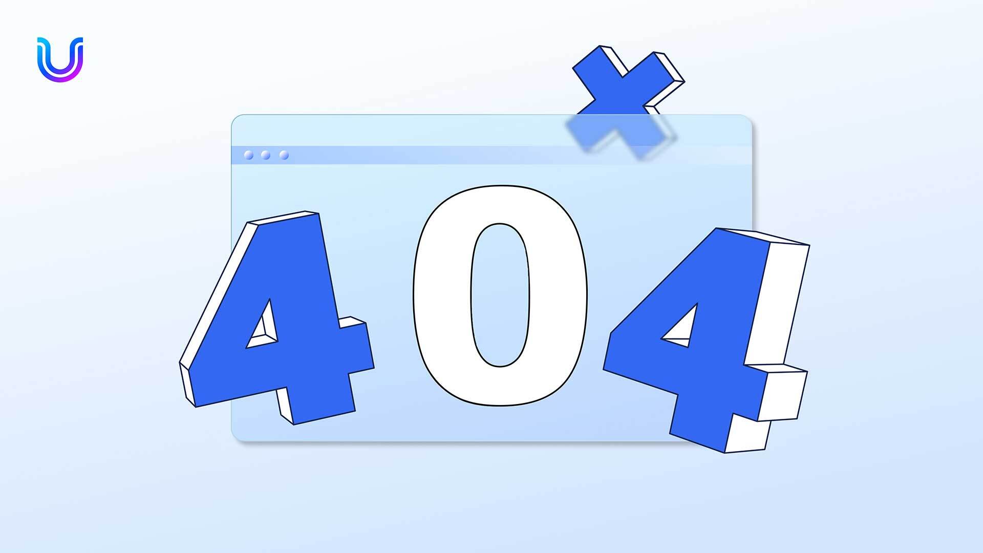
What are 404 pages?
A 404 page is the internet’s way of saying, “Oops, we can’t find what you’re looking for.” When you click on a link or type a URL that doesn’t exist or has been moved without redirection, the server responds with this infamous error code: 404.
Let’s look at a couple of components to the 404 page:
The 404 response: A ‘404 response’ is a standard HTTP status code that signifies the server was unable to find the requested webpage, indicating it either does not exist or was moved without redirection.
The “404 Server Not Found” error: This signals that the server could not locate the requested webpage, typically due to a broken link or a page that has been removed or relocated without proper redirection.
Now, why do they exist? The web is a dynamic place; pages move, links break, and content gets deleted. 404 pages serve as a gentle buffer, informing users that the specific content they’re after isn’t available, without just leaving them staring at a blank screen or, worse, letting them think something’s wrong with their device.
But it’s not all doom and gloom! A cleverly designed 404 page can actually enhance the user experience. It offers an opportunity to inject a bit of personality or humor, provide helpful links, or suggest alternatives. Essentially, it turns a potential frustration into a moment of delight – and an opportunity for redirection, helping to retain the user and guide them back to valuable content.
How do you handle the UX of 404 pages?
In the rush to rectify the inconvenience of a 404 error page, two components to digital navigation often take a back seat – UX and web accessibility.
Handling the UX of 404 pages involves turning a potential user frustration into a positive interaction. To do this, you should ensure the page clearly communicates the error, maintains the website’s look and feel, and provides helpful navigation options. Offering a search bar, links to popular or home pages, and a simple, empathetic message can guide users back to valuable content, minimizing disruption in their browsing experience and maintaining a positive connection with your brand.
Web accessibility is intrinsically connected to the UX of 404 pages because it ensures that these error pages are usable and understandable for all users, including those with disabilities. By using accessible design features, such as readable fonts, clear navigation aids, screen reader compatibility, and keyboard navigability, you make sure that everyone, regardless of their abilities, can continue their website experience in a barrier-free way.
Website owners should treat the UX and web accessibility as part of the same family, each playing a pivotal role in making the web experience inclusive. Together, they work harmoniously to ensure the digital environment is welcoming for users.
When your site is designed with UX and accessibility in mind, 404 pages go beyond being simple error alerts. They showcase an effort to engage and assist users, transforming these pages into chances to show empathy and thoughtfulness. By guiding users back smoothly, they turn potential frustration into a reassuring experience.
What should a “404 Not Found” website error page include?
So how can you practically fix your 404 pages? And how do you align accessibility with UX design?
While the primary focus tends to be on clever design or witty messaging to mitigate user frustration, ensuring that your 404 pages are navigable and understandable for everyone is equally important.
Here are key ‘web accessibility-specific’ features to focus on:
1. Screen reader-friendly text
Ensure that all your content can be easily read and understood by screen reader software, allowing visually impaired users to navigate your site effectively.
2. Keyboard navigation compatibility
Enable users who cannot use a mouse to navigate your site efficiently using keyboard controls, ensuring they can access all elements easily.
3. Clear, high-contrast visuals
Implement visuals that stand out with sufficient contrast, helping those with visual impairments to distinguish different elements on the page.
4. Proactive accessibility measures
By considering these and other accessibility features, you help all visitors navigate your site smoothly, turning potential barriers into positive interactions and building trust and loyalty with your users.
5. Test for accessibility
Utilize various accessibility testing tools and consult WCAG (Web Content Accessibility Guidelines) to ensure your 404 page meets the necessary standards.
How to incorporate accessibility with UX design
There’s no one size fits all with 404 pages but there are distinct ways you can make yours user-friendly so your visitors’ journey is more enjoyable. Having established the foundation with web accessibility pointers, let’s broaden the discussion to encompass general UX design principles.
Just as accessibility ensures usability for all, including those with disabilities, good UX design enhances the overall experience for every user, making interactions enjoyable and efficient. Here are some UX pointers to consider:
1. Use consistent language: Maintain a consistent look and feel across your website to promote intuitive navigation and a cohesive user experience. This includes using familiar UI patterns, consistent typography, and a harmonious color scheme.
2. Make site navigation easy: Ensure that users can find what they are looking for with minimal effort. This can be achieved by implementing clear and logical navigation structures, using descriptive labels for links and buttons, and providing helpful cues like breadcrumbs or search functionality.
3. Make your content engaging: Captivate your audience with compelling, relevant content that is easy to digest. Break text into scannable chunks, use engaging visuals, and adopt a conversational tone to keep users interested and invested in your site.
4. Let users give feedback: Encourage user interaction and provide immediate feedback for user actions. Interactive elements should be responsive and informative, whether it’s a form submission confirmation or a hover effect indicating a clickable element.
Stay ‘on brand’ – Use your 404 page as an opportunity to reinforce your brand identity. Consistently applying branding elements like logos, color schemes, and typography ensures the page feels integrated with the rest of your site, providing a cohesive user experience
So there you have it, turning a little error into an opportunity to shine and show just how engaging and accessible your site can be. Following these principles, users are more likely to stay on your website and engage with your brand.
404 pages: 4 examples from top brands
A well-crafted 404 page can not only lighten the mood but also keep users engaged and guide them back on track. Here are 4 standout examples of 404 pages that excel in creativity and user-friendliness:
1. GitHub’s 404 Page: It features a cute parallax effect where the background moves at a different pace than the octocat mascot in a spaceship, providing a playful yet simple design that invites users to either report the error or return to the homepage.
2. Disney’s 404 Page: Disney’s error page showcases character animation with Ralph and Vanellope from “Wreck-It Ralph,” turning the error encounter into an entertaining and memorable experience while still offering clear options to navigate elsewhere.
3. Airbnb’s 404 Page: Airbnb uses a simple, friendly illustration of a person looking through binoculars, seemingly lost, accompanied by clear and concise text. It effectively maintains the brand’s friendly tone and offers a search bar and navigation options to help users find their way.
4. Sprout Social’s 404 Page: Sprout Social chooses a clean, on-brand approach for its 404 page, often incorporating a friendly message and clear, inviting graphics that reflect their focus on connectivity and community.
These examples demonstrate that a 404 page done well can help to reinforce your brand’s personality, retain user interest, and delight visitors during an unexpected detour in their browsing journey.
UserWay: empowering users through accessibility
For designing accessible and user-friendly 404 pages, UserWay’s Accessibility Widget offers a powerful solution to enhance accessibility with minimal effort, ensuring your 404 pages are inclusive to all users. With just a few clicks, you can ensure these error pages are accessible to all users, including those with disabilities. The widget’s seamless integration and ease of use make it an ideal solution for maintaining engagement even when visitors stumble upon a 404 error. Add UserWay to your site to move your error page toward great UX and accessibility so your 404 pages are not roadblocks, but rather accessible detours.
FAQS
What is a status code 404?
The status code 404 is an HTTP response indicating that the server could not find the requested resource, typically signaling a broken or dead link on a website.
How does web accessibility tie into user experience (UX)?
When you improve accessibility, you’re essentially boosting the UX by making sure everyone, regardless of ability, has a smooth, enjoyable journey on your site.
What do 404 error pages matter?
404 error pages matter because they are a critical touchpoint in the user experience. When visitors encounter a 404 page, it means they’re looking for something that they can’t find, which can be frustrating. A well-designed 404 page can mitigate this, save you from potentially losing traffic and maintaining engagement.
Can making my 404 page more accessible really impact my site?
Absolutely! An accessible 404 page can keep visitors from bouncing and show that you value all users, which is a huge win for your brands’ reputation and user retention.


Share