Your Guide for Achieving Tooltip Accessibility
 Chris Mays
Well-designed tooltips should be simple for everyone to understand and use, including the over one billion people with disabilities. And that’s why tooltip accessibility should be a top priority for your website. End users want immediate, stress-free results, and driving them away only takes one minor roadblock.
Did you know over 70% of people with disabilities immediately abandon inaccessible websites? But that path is entirely avoidable, and this blog helps you discover how accessible tooltips can enhance UX to attract and retain more customers.
Before we cover some guiding principles, let’s start with a definition of tooltips and how they impact end users.
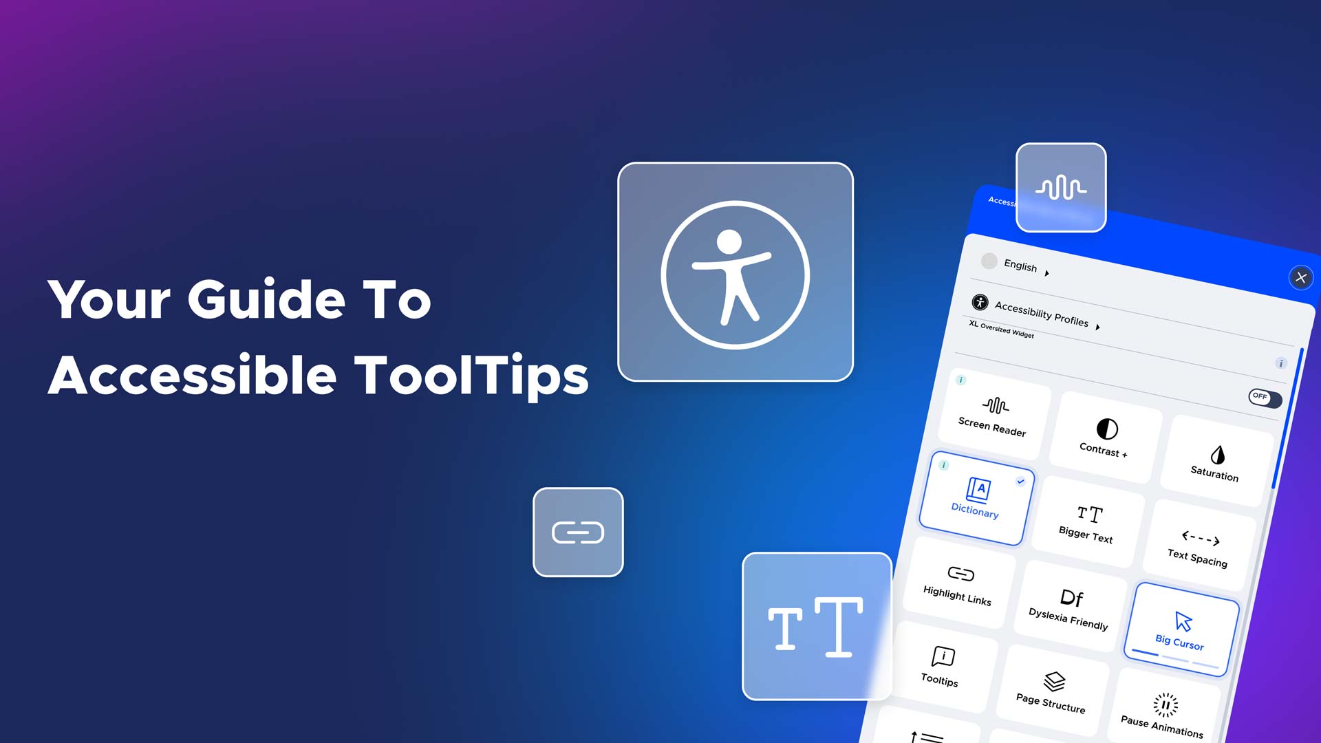
What is a Tooltip?
Tooltips are information guides that appear when end users engage with specific navigation elements. Traditionally, they appeared when cursors hovered over a top menu item or hyperlink. But like most web technology, they’ve become considerably more dynamic.
Let’s look at some tooltip examples below:
- Onboarding: Product tours are a typical onboarding example. They guide end users through specific workflows or cover the most critical product UI and functionality elements.
- New Feature Announcements: Sometimes, a subtle product reveal is needed, and a single tooltip, with its compact dimensions, does the trick.
- Interactive Walk-Throughs: Tooltips are an excellent choice for action-driven topics (e.g., complex workflows) that become invisible when end users engage elsewhere on the site.
- Contextual: The more unique features may need a big-picture (contextual) explanation for end users. A spreadsheet database, for instance, may have myriad elements to explain, and a properly executed tooltip can substantially simplify its purpose and definition.
- Product Engagement: People want quick access to your product descriptions to make the right purchase for their needs. A well-executed product tooltip can lead them into your coveted sales funnel.
So when should you avoid using tooltips? You may want to refrain from using them for:
- Permanent Resources: Don’t use tooltips for mission-critical content or anything end users need access to and interact with regularly.
- Constant Reminders: Avoid tooltips for repeated actions that people regularly do. For instance, you’d probably get annoyed if an email platform placed a tooltip on the in-box icon.
Now that you know the different types of tooltips and what to avoid, let’s learn some best practices.
Tooltip Design Best Practices
Successful tooltips can increase product adoption and even enhance brand loyalty. And implementing them should be based on your overall company and website objectives. The best practices below are an excellent starting point:
-
Digital Accessibility is Critical
Firstly, it’s the law according to the WCAG, and legal penalties for non-compliance can be steep. But above all, it’s an ethical obligation to provide an equitable web experience for people with disabilities. The following bullets provide design principles for accessible tooltips. Use Web WAI-ARIA guidelines to ensure all your tooltips are accessible to everyone.
-
Use Optimal Color Contrast
Tooltips must have ample color contrast against any background to ensure maximum readability for end users of every ability.
-
Location is Everything
Remember, tooltips should be helpful but never intrusive. They should never obscure critical elements on a website.
-
Make Content Short and Concise
Your tooltips need a header and body, or you can leave the header out. Use bolder fonts and headers to grab attention for urgent messages. But we recommend smaller fonts and less text for more standard communication.
-
Limit Your Word Counts
Limit your text to 150 characters, optimizing readability for users of every ability level. And distribute longer messaging into several tooltips to save space and prevent information overload.
Tooltips: Just One Crucial Facet of Digital Accessibility
Isolating tooltips as a topic illustrates the greater overall need for web accessibility. Tooltips are just one of many UX elements that define the end-user experience. Much like menu navigation and content format, a well-executed tooltip can encourage end users to choose your site and business more often. Likewise, a poorly executed design/UX element can make end users abandon your site altogether.
And this speaks to the bigger picture concerning digital inclusivity. Most websites are still not digitally accessible, despite increasing legal enforcement and ever-growing demand for assistive technology. But there’s no reason to get discouraged or overwhelmed. You don’t have to be alone in your quest for greater accessibility.
Advancing technology and related support systems can help you make your site accessible and legally compliant at a reasonable cost. Tackling these issues without external help is a daunting, often cost-prohibitive approach. You just need to take that critical first step.
See why UserWay should be with you every step of the way.
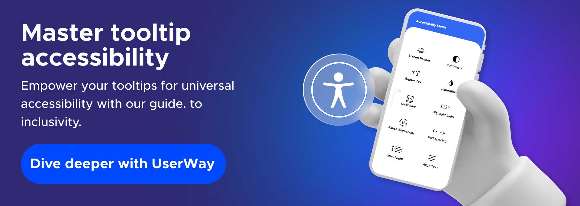
UserWay: Globally Trusted for Accessibility & Compliance
Over one million companies globally trust UserWay for their accessibility and conformance needs. Learn how our AI-powered solutions, commission-driven partnership programs, and attorney-led legal support can get you where you need to go quickly and easily.
Get invaluable guidance from an accessibility expert, or start a free trial today
Answers to Common FAQs
What Are the Main Types of Tooltips?
Standalone and alternative. Standalone tooltips provide more context on a singular product feature. Alternative tooltips are typically product walkthroughs or other similar user flows.
What’s the Best Strategic Placement for Tooltips?
Position them alongside their corresponding UI variables (e.g., buttons and icons) at the pointer’s head or tail. And never let them cover what they need to explain.
Can a Tooltip Also Be a Button?
No. Although tooltips typically correspond to and help guide users through navigation, they must be separate from buttons and other UI elements.


Share