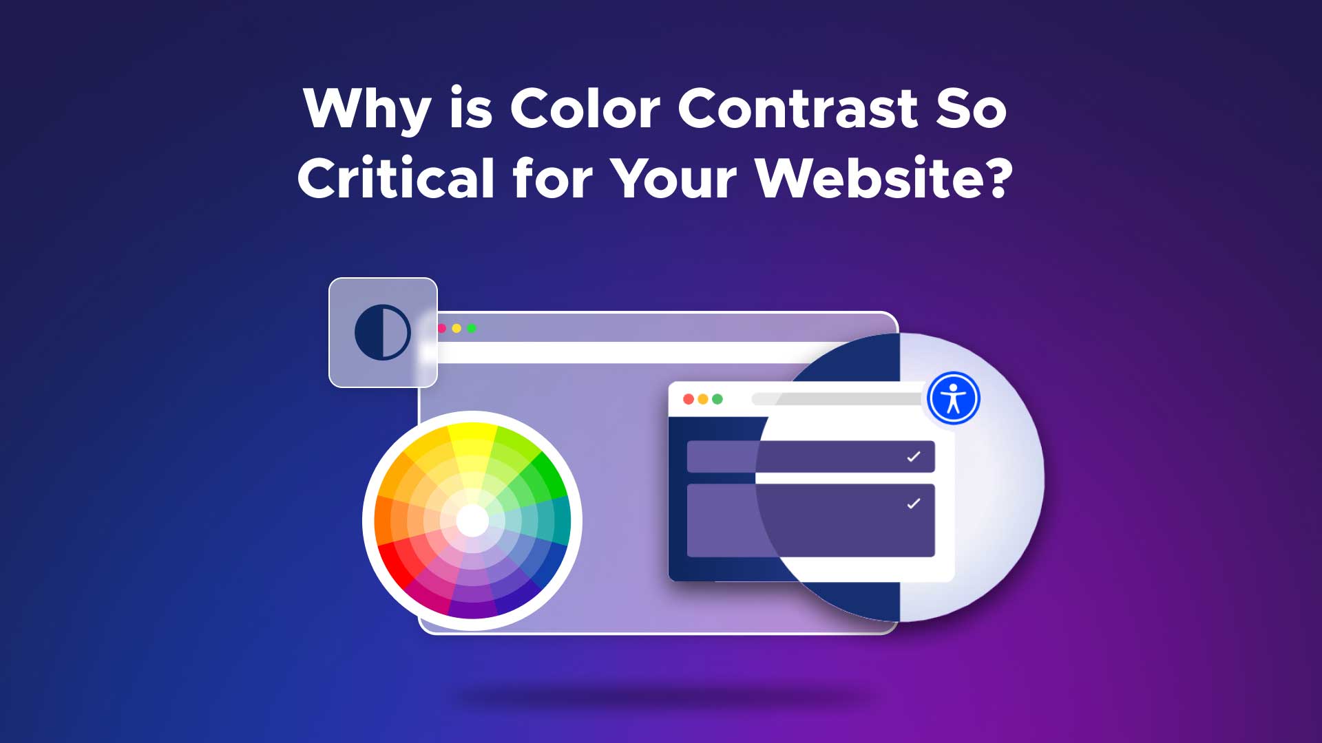
What is Color Contrast and Why it’s Critical to Improve Accessibility
Remember the unreadable script fonts and bright color text on light backgrounds that were prominent in the websites of the 90s and early 2000s? Unfortunately, websites like these are not a thing of the past and still persist today. The issue with these websites is that the color contrast is off, making the text illegible. Even if a user doesn’t have poor eyesight, poor color contrast can present significant problems in understanding the content on a webpage.
Color Contrast in Accessibility?
In school, students are taught about contrasting and complementary colors. While certain colors might look pretty next to each other, they might not be best for a website because of the way they contrast.
Color contrast refers to the difference in luminance between text and background elements.
It is best to use high-contrast colors for text and background of websites, which will ensure that the text will stand out and is easy to read. Low contrast colors will make it difficult to differentiate between the background and the text..
Contrasting colors examples include pairings like black and white or purple and yellow. These colors contrast each other and are easy for viewers to see and differentiate between.
Why is Color Contrast Important?
Color contrast is important because text and background colors can determine how people interact with the content that is written in those colors. Low contrast colors are difficult to read when text contrasts poorly with background colors, while high-contrast colors are easier to read when paired together.
According to the United Kingdom’s National Health Service (NHS), 1 in 12 men and 1 in 200 women have a color vision deficiency. Color deficiency reduces a person’s ability to distinguish between the different shades of yellow, red, and green. This means that they may only be able to tell there is a difference in color and perceive text if it has high contrast.
How Do I Know If I Chose the Best Contrast Colors?
It’s not always easy to tell if there is a color contrast problem on a webpage simply by looking at it. It may seem like the text appears just fine to your eyes, but it may pose a significant challenge for someone else to read.
WCAG 2.1 guidelines give a precise guide for the acceptable contrast ratios on websites. The W3C group says the following color contrast guidelines to reach WCAG 2.1 Level AA.
- Normal text and images should have a contrast ratio of at least 4.5:1.
- Large Text: These should have a contrast ratio of at least 3:1. This is defined by the WCAG to be font sized larger than 18pt or bold 14pt font.
- Decorative text or images: These aspects that are not visible or contain other visual content don’t require contrasting colors.
- Logotypes: Any text that is a part of a logo doesn’t have a contrast requirement.
Ensure your website meets color accessibility standards
Making your website accessible is a critical step to ensuring that everyone can access your content. While there are many things to consider when building a website, creating one that strongly adheres to the current and future WCAG guidelines will serve you well in the future. As more internet users age, these accommodations will become increasingly more important in allowing them to use the web without hassle. Updating the color contrast on your site is just one more simple way to help your visitors out. After all, they’re the most important reason to have a website!
UserWay’s colors checker determines if colors are within the WCAG 2.1 guidelines. All you have to do is enter the hex codes, which are the six-digit codes that represent each color, into the “Foreground Color” and “Background Color” boxes. The color contrast analyzer will then generate an image of your website and tell you whether or not you meet the WCAG 2.1 AA (or even stricter AAA) requirements.
If your site fails this contrast assessment, you can adjust the colors in the ADA color contrast checker until they pass the accessibility requirements. Then, you can modify your website using these new hex codes to ensure your site has good complementary contrast colors.
FAQ
What is an example of color contrast?
An example of color contrast would be white text on a black background. An example of low-contrast colors would be yellow and white. These colors are more difficult to read as there is no light and dark color separation between them.
What is the difference between color and contrast?
The difference between color and contrast is that contrast is how two colors are different or similar. Colors with high color contrast will be easy to read when paired together as text and background. Low-luminance contrast colors will be difficult to distinguish text from background color if used together.
What is the minimum color contrast ratio according to the WCAG?
The WCAG specifies that the minimum color contrast ratio should be 4.5:1 for normal text, and 3:1 for larger text. However, decorative images and logotypes don’t require contrasting colors.


Share