Tips & Best Practices to Enhance Website Navigation, UX, & Accessibility
 Chris Mays

Websites with a sleek look and feel to their UI (User Interface) and design can have higher bounce rates based on the ease and process of navigation. Online users with difficulty navigating a website will quickly leave the site. People with disabilities may find complex website navigation that’s inaccessible even more frustrating due, despite an engaging design.
Forbes shares that website users invest just over 6 seconds to check out site menu navigation. Compare that to an average on-page dwell time of 54 seconds and it’s clear how critical website navigation is to user engagement and experience. Poor user experience (UX) is frustrating. Best practices in navigation, design, and UI ensure resources and information are easily accessible. Websites supporting assistive technology enhance UX, attracting and retaining a loyal customer and user base.
Website UX supporting digital accessibility is inclusive of people with disabilities, a critical factor to consider now more than ever. A study indicates that just under 40% of website users scan website navigation links and layout when first landing on a page. In-depth research from the American National Library of Medicine states that just below 43% of studies conducted on website navigation focused on effective hierarchy and navigational structure.
Let’s break down some of the essential elements of website navigation and design, starting with a quick review of menu and structure as critical elements of user experience.
What is a Website Navigation Menus & Structure & What’s Their Impact?
Website navigation in a nutshell is the critical component of your site UI, from text, to buttons, links and code. All of these are embedded in the site composition and navigating them with ease greatly depends on menu and accessibility of design and functions. Navigation menus and structure impact user engagement with products and services, particularly when it comes to the layout of hyperlinks, content, and intuitive product labeling that are pertinent to streamlining UX.
Effective Website Navigation Can:
- Simplify comprehension of your site’s user path and content
- Gain trust of users with a credible presentation of products and services
- Enhance your company’s overall user experience
Navigation menus are often a significant factor in how users will interact with your site, and the design options today are vast, but best practices indicate that some are more effective and easier to navigate than others. Menus include the links to pages of your website that can be laid out in various ways – horizontal navigation bars, sidebars, dropdown navigation menus, and hamburger navigation menu. All of these options play a role in UX both on desktop and mobile.
Horizontal Navigation Bar – Common Best Practice in Website Headers

Horizontal navigation bar menus are commonly used in the header of websites. Most of them include the core pages of your website, like products and solutions, about, resources and blog, and contact. Best practices for SEO (Search Engine Optimization) tell us that the menu should generally include a minimum of 5 pages. Standardized page names are common, but adding a customized touch can make your site standout and adds an edge to branding and engagement.
Why Choose Vertical Sidebar Menu Navigation?

For websites that have a more extensive list of pages to navigate, vertical sidebar menu navigation can offer a streamlined and frictionless user experience. Pages are stacked vertically, and users need only scroll and move from one page to the next with the ability to choose their path easily. On a design level, it allows the focal point of your website to be rich with visuals with an innovative and sleek navigation menu. Specific industries like e-Commerce, finance, banking, and real estate will opt in for this type of website navigation structure.
Dropdown Menu Navigation for Complex Information Architecture
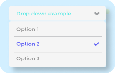
The Information Architecture (IA) of a website is the structural hierarchy of a website map, with UI and design being the visible and engaging elements of how we interact with a site. Dropdown menu navigation is often adopted and useful for websites with a complex IA, particularly with pages that serve as a starting point to navigate to subtopics and categories that fall under a larger scope or field. Dropdown menu navigation can be frequently seen in online retail and eCommerce sites, while also used for companies with multiple products to list or various resource menus, from blogs, to case studies, and customer success stories.
Hamburger Navigation Menu: Mobile UX & Accessibility

Forbes indicates that nearly 60% of website traffic in Q2 of 2022 came from mobile devices. Providing a seamless and intuitive user experience on mobile is critical and many websites will use the hamburger navigation menu for its ability to collapse and unobtrusive design to the entire page. On mobile, touching the hamburger navigation menu will list pages vertically, and on larger screens it may distribute pages horizontally. Navigating a website this way can be useful for sites with limited pages or those focusing heavily on visuals and design.
10 Website Navigation Best Practices for Digital Accessibility
1. Headings to Optimize Accessibility
Website headings delineate content into sections helping end users skim for the content they need, while also supporting screen-readers for simplified, inclusive web accessibility. This is particularly important for product pages and any major segments of your site that you want end users to access seamlessly.
2. Intuitive Website Navigation Design
Intuitive website design improves end users’ page-to-page user experience, orientation, providing expected website navigation elements like text formatting and hyperlinks. Most online users have adapted to certain website navigation design conventions – like the types of menus listed above, buttons, and more. Giving them the frictionless user experience with intuitive website navigation design ensures optimal accessibility.
3. Maximize Text Usage
Using actual text instead of text images will ensure your website is more accessible to screen-readers and keyboard navigation. Text images aren’t always clear, especially when zooming in and magnifying them. Make sure alt text is identical to the image text for consistent site messaging.
4. Font Sizes & Spacing
Accessible font size and spacing increase readability. Small sized fonts or dense lines of text with lack of vertical spacing is challenging to read. Considering visual impaired individuals means ensuring text legibility is clear and ensures messages are accessible to anyone on your site.
5. Clear Messages & Language
People shouldn’t need a thesaurus to understand your products and services, and every aspect of your website. Keep language and messages straightforward and concise with a consistent tone and jargon throughout your website content.
6. Descriptive Link Text
Hyperlinks on your website should stand out to ensure click-through rates (CTR) and accessibility. Assistive technologies like screen readers benefit from clearly defined hyperlinks website users to browse link-by-link when navigating the website.
7. Color Contrast
Textual content and background color contrast should be distinct and sharp enough to optimize readability and accessibility of your website. This can benefit all online users, but is particularly important to people with visual or cognitive impairments, leveraging the accessibility of your website.
8. Alt Text
Creating precise descriptions of images for end users ensures screen readers can access and relay the content of visuals with clarity and accuracy. Alt text is also important for SEO and ensures website navigation of visuals is frictionless and simple.
9. Captioning & Transcripts
Captioning video text with transcripts is a definite accessibility and website navigation best practice, as it allows anyone who can’t view or hear the video to access the content in alternative formats and with various tools. Transcripts of audio content like podcasts follow the same principles.
10. Web Breadcrumbs
Web breadcrumbs allows online users to retrace and track their path on a website, allowing them to be redirected to the URL address of the browser with ease. This makes navigation a website a simple process, especially when using specific sites frequently in which you want to revisit pages or identify where you saw specific content.

UserWay – Accessibility Solutions to Optimize Website Navigation
UserWay’s Widget 4.0 improves UX in allowing your site to offer a robust set of accessibility tools, while also remediating required fixes as per ADA compliance requirements. Optimizing website navigation and inclusivity while mitigating legal risk, UserWay’s Widget 4.0 has been adopted by leading organizations for seamless website navigation and accessibility.
Common FAQs
What is the Main Principle of Website Navigation?
Prioritize website navigation design to ensure a seamless and inclusive user experience by implementing the best practices and various menu types listed above. Customize the UI of your site to your target audience and for an innovative touch that supports accessibility.
How Does Digital Accessibility Affect Website Navigation?
Using a web accessibility solution to ensure an inclusive UX for people with disabilities supports seamless and intuitive navigation of your website. Adopting a tool for keyboard navigation, for example, empowers users to navigate a website when using a mouse or touchscreen is not an option.
How Can Website Navigation Impact Online Sales?
Simplified and frictionless website navigation enhances UX for a broader buyer population, particularly important to organizations selling products and services online. Website navigation and accessibility levels of your site directly affect UX, navigation, and sales bottom line.


Share