7 Tips to Improve Websites for Low-Vision Users

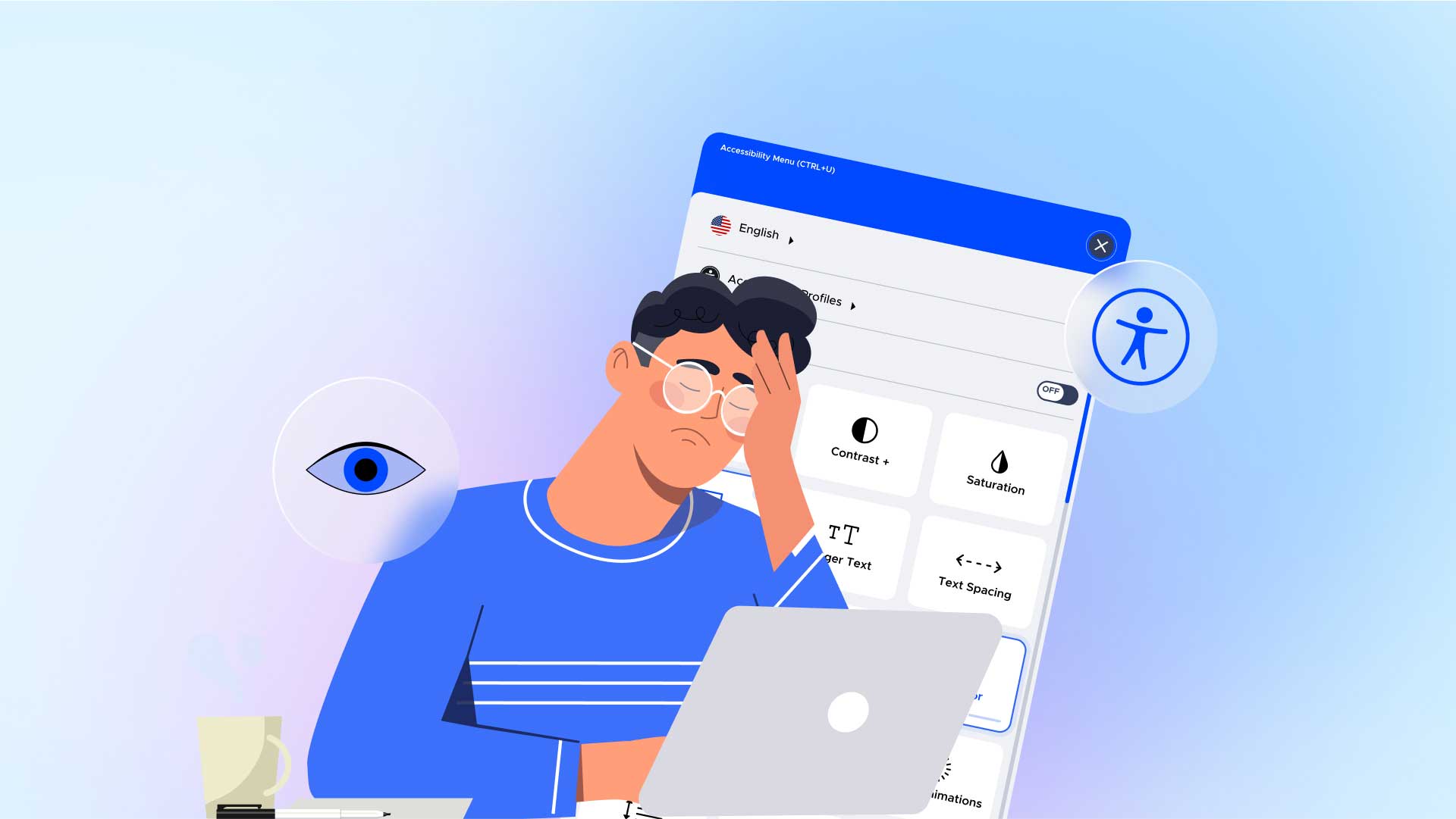
From medicine bottle warnings to ingredient labels, small text can be hard to read for almost everyone, regardless of age. Unfortunately, that’s what it’s like for people with low vision to navigate the web. Even those who aren’t legally blind but have limited vision face frustrating barriers using computers, tablets, and smartphones.
But it doesn’t have to be this way. Numerous best practices and assistive technology for low vision can make your site more accessible for all users. This blog provides proven tips to get you started.First, let’s better understand each type of vision problem.
Four Main Types of Vision Problems Affect People Worldwide
1. Central vision loss inhibits the ability to read, write and perform with precision. Facial recognition is also a challenge. However, people with this condition can perceive space and movement and have mobility without assistance.
2. Peripheral vision loss narrows the field of vision (e.g., tunnel vision) to what tightly surrounds the eyes’ visual focus point. So, people with this condition may easily read small print one minute and collide with a colorful mailbox the next. Because Peripheral vision loss prevents complete perception and the ability to follow moving objects, it’s hard to manage independently.
3. Blurry vision is like looking through frosted glass, diffusing how objects are outlined and making contrast, depth, and distance challenging to recognize. This condition can make bright lights intolerable and minimize literacy and attention to detail.
4. Visual disorders following brain injuries come in several variations. These include trauma and brain damage often related to attention, memory, or behavioral issues. In most cases, these disorders don’t impact visual functionality but the brain’s capacity for analyzing information.
Next, you’ll learn proven tips for better website accessibility.
7 Tips to Accommodate People with Low Vision
1. Zoom Capability
Text is particularly tricky for low-vision readers because website fonts are typically on the smaller side. Magnifiers can zoom to enlarge screen content so words and images are easier to see.
2. Responsive Design
This enables websites to resize seamlessly on mobile websites and devices. Responsive design also makes sites more accessible on all screen sizes when zoomed. Your best bet is to meet WCAG guidelines, enabling users to zoom at least 200% for a full view without horizontal scrolling.
3. Go Beyond Color to Communicate
To simplify UX for all abilities, use elements besides color to represent alerts, warnings, text links, and buttons. For example, all underlined text should represent an active link for colorblind users.
4. Keyboard Navigation
People with low vision may use a keyboard to engage with websites because their condition prevents them from using a mouse.
5. Optimal Contrast
Low-vision end users need specific contrast ratios for content legibility:
- All standard-sized text requires a 4.5:1 contrast ratio between the text and the background.
- All bigger-sized text requires a 3:1 contrast ratio to comply with WCAG level AA and a 7:1 ratio to conform to AAA-level compliance.
- Black on white is the best color scheme for low-vision users, with its sharp 21:1 ratio. Use a third-party contrast checker to ensure thoroughness and accuracy.
6. Alt Text
People with blindness or low vision typically need screen readers to navigate the web. Alt text provides image descriptions for these end users so they can comprehend your site’s overall content.
7. Descriptive Page Titles
Screen readers announce page titles for people with limited vision (e.g., vision focus problems). The more explicit the description, the easier it is for people with low vision to comprehend content without scanning an entire page.
Conclusion: A Better Vision for All End Users
A website accessible to people with low vision should accommodate all disabilities. Fortunately, the best practices summarized in this blog will point you in the right direction. And reinforcing your efforts with a reputable digital accessibility platform will help you remediate all related problems on your site. Nearly everyone needs the web to manage their lives in today’s world, including over one billion people with disabilities. So don’t hesitate to commit.
Discover why over one million websites rely on UserWay for digital accessibility.
UserWay: Expand Your Accessibility Potential
UserWay is devoted to digital accessibility for all, including those with low vision. That’s because we stand behind the principle that digital accessibility is an inalienable right for people of all abilities. Learn how our comprehensive framework of AI-powered tools can make your site accessible and compliant with all critical laws.
Answers to Common FAQs
What’s the Best Way to Test Your Site for Vision Problems?
Go straight to the source. Recruit people with vision-related disabilities to assess your site’s UX. There’s no better way to tell where your site excels and falls short accessibility-wise. It’s also wise to conduct an accessibility audit to ensure you fix all related issues.
Do Websites Have to Be Accessible to People with Vision Issues?
The Americans with Disabilities Act (ADA) mandates that websites be accessible to people with disabilities. It’s also best to follow WCAG guidelines for digital accessibility to meet compliance.
What’s The Recommended Browser for People with Low Vision?
WebbIE is a popular browser for people with low vision and other vision-related conditions. Its accessible, text-only technology works seamlessly with screen readers.


Share