Digital Eye Strain: A barrier to digital accessibility
Here’s something people of all ages and backgrounds can relate to in our digitally-driven world. Screens are integral to our daily lives, and we spend more time in front of them. This widespread use has increased the prevalence of digital eye strain, also known as digital eye fatigue, computer eye strain, or computer vision syndrome.
This all-to-common condition results from the extensive use of digital devices like computers, smartphones, and tablets. Symptoms range from dry eyes to headaches, creating barriers to online engagement and overall digital accessibility.
Let’s explore the meaning, causes, effects, and solutions for digital eye strain, including how it impacts digital accessibility. We start with a basic definition.
What is the meaning of digital eye strain?
Digital eye fatigue generally occurs when the eyes feel strained, overused, or stressed, leading to discomfort and fatigue. However, with the increasing reliance on digital devices for work, education, entertainment, and socializing, digital eye strain has emerged as a distinct subset of this condition. Unlike traditional activities like reading a book or working with paper documents, digital tasks often involve staring at screens for extended periods, which can worsen eye strain symptoms.
What are the symptoms of digital eye fatigue?
Recognizing the effects of digital eye strain symptoms is crucial for effectively addressing the condition. Symptoms can include:
1. Eye discomfort or pain
2. Dry, irritated eyes
3. Blurred or double vision
4. Headaches
5. Neck and shoulder pain
6. Difficulty focusing
7. Sensitivity to light
Eye strain symptoms and challenges can vary in intensity and worsen with increased screen time. Ignoring these signs can lead to further complications and hinder end users’ ability to participate fully in digital activities.
What are the causes of digital eye strain?
Several factors contribute to the development of digital eye strain:
1. Prolonged screen time without breaks strains the eyes and surrounding muscles.
2. Inadequate lighting conditions, such as glare from screens or harsh overhead lighting, can increase eye strain.
3. Improper screen settings, such as brightness and contrast, can strain the eyes.
4. Poor posture while using digital devices can lead to neck, shoulder, and back strain, exacerbating discomfort.
5. Uncorrected vision problems may heighten eye strain when using digital devices.
How does digital eye strain impact digital usage?
Although digital eye strain is usually a temporary, treatable condition, it impacts end users’ ability to participate on websites, apps, and devices. Considering how many people experience this condition, reducing eye strain from screens can make a substantial difference.
1. Accessibility challenges: People experiencing digital eye strain may struggle to engage with digital content or navigate online platforms effectively. Similar obstacles can prevent their access to essential services, educational resources, or online employment opportunities.
2. Productivity and learning barriers: Digital eye strain can impair concentration and productivity, affecting performance in academic, professional, or personal endeavors that require digital engagement.
3. Socioeconomic disparities: People from lower-income backgrounds may have limited access to resources that can alleviate digital eye strain, like ergonomic furniture, proper lighting, or regular eye care services. This worsens existing inequalities in digital access and participation.
4. Health implications: Long-term exposure to digital screens without addressing eye strain can lead to more severe eye problems, potentially resulting in vision loss or other eye conditions.
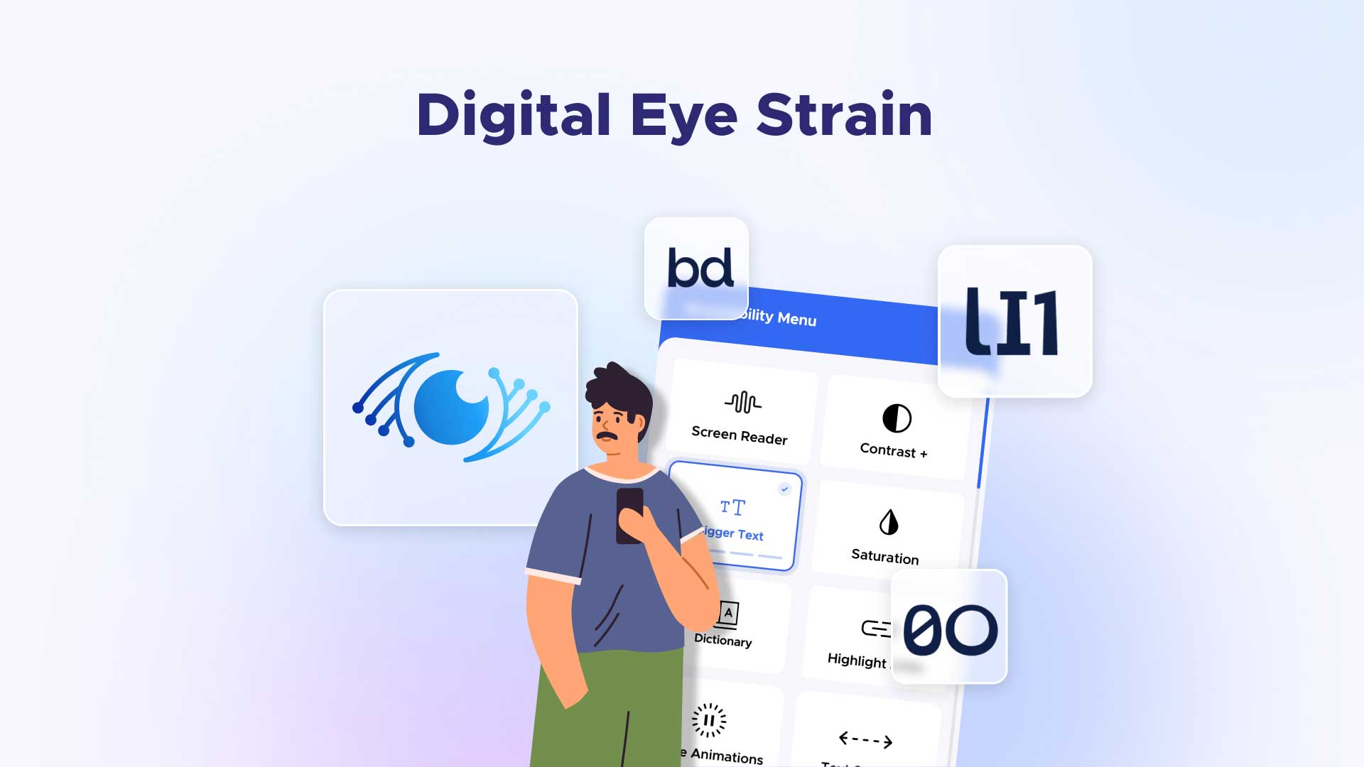
What are the best eye care tips for digital eye strain relief?
Reducing digital eye strain from screen exposure involves proactive measures that help prevent related symptoms and improve digital inclusion. Here are some proven tips for reducing eye strain.
1. Follow the 20-20-20 rule: take 20-second breaks in 20-minute intervals, during which you view screens from a 20-foot distance.
2. Adjusting screen settings: Optimize display settings such as brightness, contrast, and font size to reduce eye strain.
3. Ensuring proper lighting: Proper lighting is one of the best workplace and home-use adjustments for reducing eye strain.
4. Minimize glare: Position screens accordingly and use ambient lighting that’s comfortable for the eyes.
5. Practice good ergonomics: Maintain a comfortable viewing distance from the screen, and use ergonomic furniture to support posture.
6. Get regular eye exams: Treatment for digital eye strain means addressing underlying vision problems and ensuring that corrective lenses are current.
7. Blue light filters and eye strain: Consider using screen filters or blue light-blocking glasses to reduce exposure to harmful blue light emitted by digital screens.
8. Encourage digital literacy: Educate individuals on recognizing and managing digital eye strain to promote healthy digital habits.
A temporary condition with far-reaching impacts
Digital eye strain is not merely a discomfort but a significant barrier to using the web effectively. This widespread condition can impact more than 50 percent of end users, negatively affecting overall web engagement. By raising awareness about the related symptoms, causes, and methods for preventing digital eye strain, we can help end users of all abilities get back on track in the digital world.
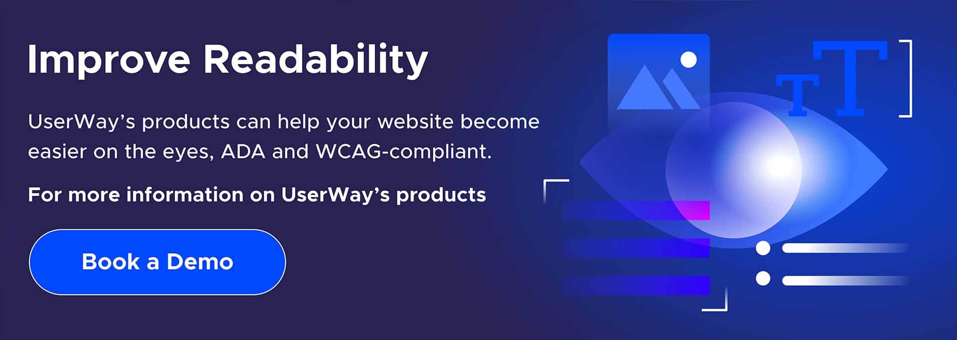
UserWay: a distinct vision for better accessibility
UserWay is today’s solution for tomorrow’s accessibility challenges. From AI-Powered Accessibility tools to ongoing monitoring, attorney-led legal support, and big-business solutions, UserWay is breaking new ground to improve your web accessibility and compliance.
Start your accessible future today.
Answers to common FAQs
What does digital eye strain do?
It causes eye watering, headaches, tired eyes, burning sensations, red eyes, irritation, dry eyes, blurred and double vision, and more.
What’s the recovery time with digital eye strain?
It typically lasts a few hours after engaging in screen time. More severe cases last several days.
What do statistics tell us about digital eye strain?
Estimates show it may affect over 50 percent of end users.


Share