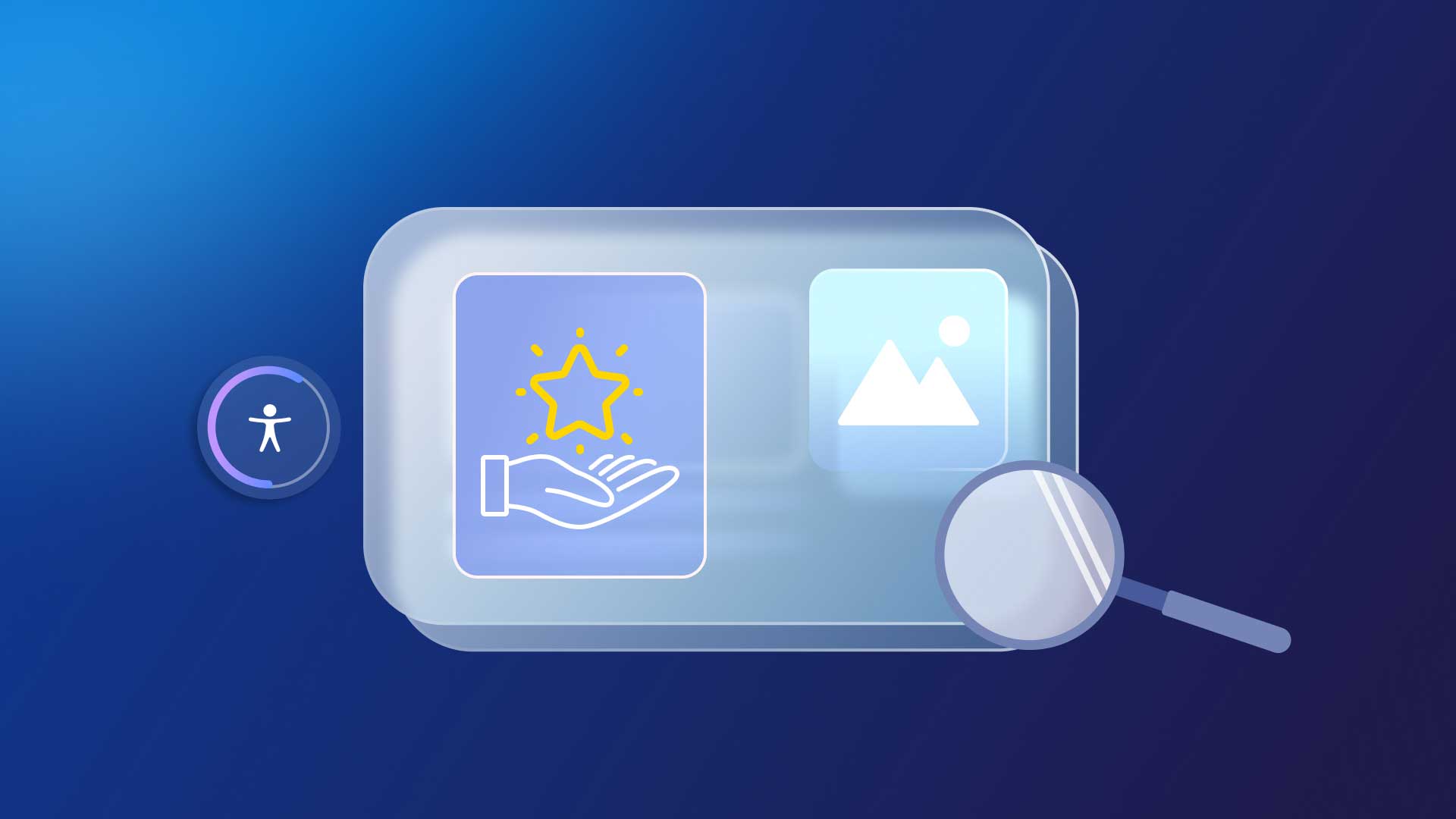
Web Accessibility Features: Everyone Benefits From Inclusion
When the Web Content Accessibility Guidelines (WCAG) established guidelines for which website accessibility features ensure a compliant online presence, their primary objective was to accommodate online all users with diverse needs, disabilities, or impairments.
Under the WCAG, Website owners are liable for the accessibility of any commercial space, and any public-facing online assets that sell or market a product or service must be inclusive of all individuals.
What’s often overlooked is the potential for any one of us to develop disabilities, impairments, or experience conditions and circumstances whereby web accessibility benefits us, simplifying and enhancing User Experience (UX) and online engagement.
From an end user’s location, to their age, demographics, Internet connection, and a variety of online user needs, integrating accessibility options into websites to empower online user needs inherently celebrates Diversity, Equity, and Inclusion (DEI) in the digital age.
Leveraging cutting-edge, cost-effective technologies to embed web accessibility features broadens your audience, offering benefits to users from diverse backgrounds. These features promote inclusivity, catering to students, age-specific groups, rural inhabitants, and individuals across different devices, ensuring access anywhere, at any time.
Let’s take a deeper look at some of the web accessibility features that can benefit everyone and anyone online, from image alt text, to audio transcripts or captions, color contrast, simplified language, and more.
What are website accessibility features?
Accessibility features are essential tools within technology that facilitate user interaction for individuals with disabilities. They encompass a broad spectrum of functionalities designed to assist various needs, including visual, auditory, motor, and cognitive impairments. For instance, screen readers and text enlargement support those with visual impairments, while closed captions aid individuals with hearing difficulties. Voice recognition technology enables users with motor impairments to navigate devices effectively. By integrating these features, technology becomes more inclusive, ensuring all users have equitable access to digital content and services.
What are the 4 principles of accessibility?
The WCAG outlines four principles of accessibility. Often abbreviated as POUR, these principles provide a framework to ensure content is accessible to all users, including those with disabilities:
1. Perceivable: It’s imperative that information is presented through multiple mediums to guarantee that no user’s sensory abilities are a barrier to accessing content. This principle mandates that information be detectable and discernible to all users.
2. Operable: The necessity for interactive elements and navigation to be universally operable cannot be overstated. This includes accommodating a wide range of devices and assistive technologies, ensuring that no user is excluded from engaging with content.
3. Understandable: Clarity and predictability are non-negotiable; information and user interface operations must be intelligible. This ensures that content is logically structured and predictable, minimizing confusion and enhancing user experience.
4. Robust: Durability in content interpretation across an array of platforms and technologies is essential. This robustness ensures that content remains accessible amidst evolving technological landscapes, standing resilient against the test of time and advancement.
You can learn more about accessibility principles from the Web Accessibility Initiative (WAI) at the World Wide Web Consortium (W3C) website. They provide detailed guidelines and resources.
Why are accessibility features important?
Accessibility features are important because they ensure everyone, regardless of their abilities or disabilities, can access, use, and benefit from technology and digital content. They promote inclusivity, enhance user experience, and support equal opportunities, enabling all individuals to participate fully in society.
Going deeper, the importance of accessibility features extends beyond individual user benefits to broader societal and ethical implications:
1. Legal compliance: Many regions have laws and regulations mandating digital accessibility, so incorporating these features helps organizations comply with legal standards, avoiding potential fines or litigation.
2. Market expansion: By catering to the needs of people with disabilities, organizations can tap into a wider market, reaching more customers and users who might otherwise be excluded.
3. Innovation: Designing for accessibility often leads to innovative solutions that improve usability for all users, not just those with disabilities. This can include simplified navigation, clearer content, and more intuitive interfaces.
4. Corporate social responsibility: Demonstrating a commitment to accessibility reflects positively on a company’s brand, showing they value diversity and inclusion, which can enhance their reputation and customer loyalty.
5. Quality of life: Accessibility features can significantly impact the quality of life for individuals with disabilities, providing them with independence, access to information, education, employment, and social engagement, thus supporting their rights and dignity.
Ultimately, accessibility features are a crucial component of ethical design and development, ensuring technology serves as a tool for empowerment and equal participation in the digital age.
What are examples of web accessibility features?
Web accessibility features are designed to ensure that websites and online services are usable by everyone, including people with disabilities. These features address various user needs, enabling equitable access to digital information and functionality. Let’s learn more by walking through 5 key examples of web accessibility features:
1. Image Alt Text
Inclusion of image alt text is a common web accessibility function, adopted as a best practice to enable frictionless content engagement with assistive technologies. Tools like screen readers and braille displays support individuals with visual disabilities or impairments, or even cognitive challenges. Alt text is a clear, concise, and accurate description of images that’s scanned by assistive tech tools to convey the added value and insights of visual content.
But image alt text can also empower even broader audience engagement by leveraging comprehension of the important value images convey to individuals with a range of circumstances and conditions:
- An online user that may have temporary vision impairments as a result of injury or recovery from various types of eye surgeries.
- Individuals using text-based browsers like Lynx, a web browser that’s often used to simplify a user’s understanding of online content with greater speed and efficiency.
- Drives a more efficient and seamless user experience for individuals using dial-up lines to connect to the internet, a more common way to browse the web in rural locations or by those with socio-economic barriers that may find high-bandwidth and high speed Wi-Fi connections too costly. Dial-up connections can slow webpage loading time, and as result, users may disable image loading to ensure access to online content faster and with greater ease.
Image Alt text is one the web accessibility features that also drives higher ranking for SEO, as the written description of images allows search engine crawlers to index pictures accurately, helping them rank higher in a search engine results page (SERP). Online users can benefit from finding the right content more efficiently, while website owners can gain increased traffic that could transpire into higher conversion rates, lead generation, and increased engagement.
2. Audio & video transcripts & captions
Providing audio and video transcripts or captions is one of the common web accessibility options implemented to ensure individuals with hearing impairments or disabilities can acquire the added value of these visual assets.
The text of the transcripts and captions can be scanned by assistive technologies like screen readers, as Artificial Intelligence (AI) technology relays the messages of audio and video transcripts out loud. This way, transcripts can help ensure inclusion of online users with vision impairments or disabilities, or anyone who may prefer to listen to content via screen readers at any time and pace. This accessibility function can be especially useful for anyone who wants to review insights relayed following a live web meeting, webinar, or video broadcast. Transcripts and captions can also enable use of braille displays.
Individuals with ADHD will often opt to use transcripts and captions when engaging with various forms of audio or video content. While ADHD isn’t defined as a learning disability, studies show that 30-50% of children with ADHD also have a certain type of learning disability, which can compound challenges with concentration, comprehension, and the ability to stay engaged.
With the increased rate of eLearning that incorporates video and audio content, transcripts or captions can serve as a guide to help retain attention and amplify focus. This can be especially relevant if the visual content of a video is not stimulating, or on the contrary, overly stimulating and distracting.
Transcripts and captions of video and audio content also support mobile engagement of online users on laptops or smartphones in public spaces. Consider a student immersed in eLearning materials, situated in a quiet common space like a library, or anyone working in a shared open space that has muted device volume in consideration of peers. Video and audio transcripts and captions become an invaluable means to engage with the audio of these assets, even if it’s just a personal preference for processing information.
3. Color contrast
Incorporating web accessibility options like ample color contrast of text on a background inherently aids individuals with low vision, or various forms of visual impairments and disabilities. Someone who may be color blind or experience challenges deciphering colors and shades can benefit from sufficient color contrast, particularly if by default a text color is similar to background colors, tone, shade, and or from the same family.
Research indicates that 93% of American adults use the internet, and another source shares that studies have reported an increasing decline in vision contrast sensitivity for people aged 40 to 50. Sufficient color contrast can help support a barrier-free UX and improved readability for individuals with these vision challenges.
And with the increasing rate of remote work in a vast range of environments that only require internet connection, high color contrast is one of the accessibility functions enabling improved readability and optimal UX on any device or screen size, and in multiple lighting conditions. Imagine someone working with a strong glare of light that impedes their ability to read text on a background with insufficient color contrast. Having the capacity to instantly adjust, or ensure sufficient color contrast from the get-go can be game changing.
4. Simplified language and UI
One of the most important and commonly known best practices to ensure accessibility of written online content is use of simple, clear, and concise language, supporting the inclusion of people with learning or cognitive disabilities. Various conditions or impairments may cause these users to experience difficulties processing complex phrasing, jargon, acronyms, and colloquialisms. But this web accessibility option has also become an expected standard to ensure quick and simplified scanning, skimming, and processing of core ideas and key takeaways for any online user.
Written content that conveys ideas with clarity also benefits:
- a second language reader or learner
- a beginner reader
- Individuals with low literacy levels
For individuals using assistive technologies like screen readers and braille displays, using simple and clear language with accurate punctuation and grammar drives a more seamless translation of content with minimal interruptions of scanning and relaying text.
5. Intuitive & simple navigation design
The physical layout of content in a website’s UI can also be paramount to inclusion and engagement levels of diverse online users and their needs. As a rule of thumb, it’s recommended to avoid dense bodies of text, and instead, lay out content in short paragraphs with sufficient line spacing to ensure ease of readership. Distinct formatting and specification of webpage titles, headings, and links help support readership with assistive technologies like screen readers and Text-to-Speech (TTS) tools.
Let UserWay’s Accessibility Widget power your site
UserWay’s AI-powered Accessibility Widget is a game-changer for website owners, providing essential web accessibility features effortlessly. By just a single click, you can unlock a suite of critical functions that promote inclusivity and adherence to web accessibility standards.
Experience the power of automation as the widget meticulously scans your site, pinpointing areas that fall short, such as inadequate image alt text. UserWay’s comprehensive approach ensures the broadest WCAG compliance, either guiding you through user-friendly fixes or automating the process entirely. From enhancing color contrast and text spacing to enabling voice navigation and screen readers, UserWay simplifies the integration of pivotal accessibility tools, making your website welcoming for all users. Get started today.
FAQs
What are essential accessibility features for a website?
Essential accessibility features for a website include text alternatives for non-text content, keyboard navigation, sufficient color contrast, resizable text, accessible forms, and ARIA (Accessible Rich Internet Applications) landmarks for enhanced navigation. Additionally, providing captions for audio and video content, ensuring compatibility with screen readers, and implementing responsive design to accommodate various devices are crucial for making a website accessible to all users, including those with disabilities.
Why is it important to create a website with accessibility options?
The WCAG guidelines provide a golden standard for digital and web accessibility. Website owners have both a social and business responsibility to ensure online inclusion for all users, alongside legal liability to meet compliance requirements. An accessible website can help ensure sound legal standing of a business’ or organization’s online presence, while also broadening the reach of content to users of diverse walks of life globally.
How can I simplify integration of a web accessibility function into my website?
An ideal solution and best practice adopted by website owners globally is using an AI-powered web accessibility widget that automatically scans your website to identify violations and fix them, while also providing guidance for remediation, reports, and near-instant enablement of accessibility functions


Share