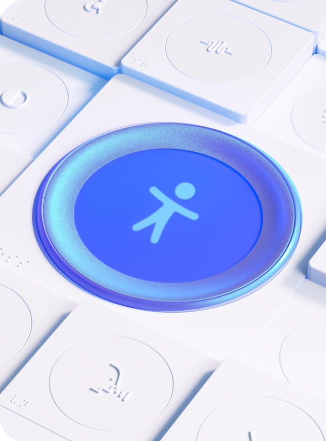
How to press play on button accessibility

When we talk about websites, buttons are a huge part of the user experience. Whether it’s the “Buy Now” button on an e-commerce site or the “Submit” button on a contact form, these website elements are vital to our online experiences. But have you ever wondered what goes into making buttons accessible for every user that visits your site? And could the lack of good button design be the reason some users may find your website challenging to navigate? But what constitutes ‘good button design’? Button accessibility is the solution, where form meets function.
Let’s take a closer look at what makes a web button accessible. In this piece, we’ll walk you through the history of buttons in web design, giving you examples of button accessibility and showcasing the positive impact accessible buttons can have on the user experience.
Neumorphism & the history of button designs
Before we dive into the mechanics of website buttons, it’s worth taking a step back to appreciate the history of button design.
The story of the button isn’t just about pixels and code; it’s about design trends, user behavior, all mixed in with a touch of nostalgia. In a word, Neumorphism. Unfamiliar with the term? You won’t be alone!
Neumorphism is a design trend that emerged a few years ago, distinctly making its mark in UI (User Interface) design, including button styling. This trend showcases soft, embossed visuals. It blends buttons with the background, giving a semi-3D appearance, using subtle shadows and light for a tactile, unified look in user interfaces.
While many admire Neumorphism’s tactile aesthetics, critics believe it can hinder usability, especially regarding contrast and clarity. The main worry is that visually impaired users may struggle to discern the beveled buttons, as they blend into the background.
As we know, navigating this design landscape requires accessibility more than just aesthetics. Now, let’s dive into the practical aspects of designing accessible buttons that do not sacrifice usability and have inclusiveness at the core.
Back to button basics: common buttons in web design
Web buttons are entry points to your content, products, and services. They play a pivotal role in user navigation, and for those with disabilities, well-designed buttons can make the difference between a frustrating and a fluid online journey. A poorly designed button can serve as a roadblock, preventing a segment of the audience from accessing the full breadth of what’s available.
With the World Health Organization stating that 16% of the global population live with a significant disability, the importance of accessible design becomes not just a matter of inclusivity, but also of broadening reach and potential engagement.
When navigating a website, users come across various buttons designed to guide their actions. Each button type has a unique role, influencing how they will interact with your web content. Before looking at the intricacies of accessible button design, let’s familiarize ourselves with the most common types of buttons users encounter on websites:
- Primary buttons: Prominently styled with a distinct color, used for important actions like submitting a form or making a purchase.
- Secondary buttons: Less prominent than primary buttons, used for secondary actions like canceling or going back.
- Ghost buttons: Have transparent backgrounds and often just a border, used for less critical actions.
- Icon buttons: Incorporate icons alongside or instead of text to convey meaning quickly, often used for actions like sharing or opening a menu.
- Toggle buttons: Allow users to switch between two states, changing appearance to indicate the current state, such as turning a feature on/off.
- Dropdown buttons: Reveal a list of options when clicked, commonly used for selecting items from a list or menu.
How to push the button on accessibility
Every element on a website tells a story, and buttons are no exception. They encourage users to take action, to explore, to engage. Yet, it’s these seemingly simple components that can make or break accessibility for many users.
Here are some practical ways you can ‘push the button on accessibility’ and craft a digital environment where every click, touch, and interaction is seamless and intuitive for all.
-
Choose the right buttons
Starting with the basics is always key. When designing accessible buttons for your website, remember to use the rightful HTML <button> tag, This serves as a clear indicator to assistive technologies, ensuring that every user, regardless of their device or technology, can accurately discern and interact with the designated action points.
-
Get the size right
Buttons should be large enough to click or tap easily. Avoid those tiny buttons that require squinting and precision. Aim for buttons that are at least 44×44 pixels. WCAG states that it’s all about making sure people can click or tap what they intend to without mistakenly hitting something else. Think about someone with hand tremors or who struggles with precise movements. They’d find it tricky to click on tiny buttons. And not everyone uses a mouse or trackpad; some people have specialized devices that might not be as precise. Get the size right so users can navigate your site while making touchscreen experiences smoother for everyone.
-
Make your button clear
Consider buttons as gateways to distinct sections of your site. Much like one would approach an unlabeled door with caution, users might be hesitant with ambiguously labeled buttons. By assigning each button a distinct and straightforward label, you’re fostering inclusivity and setting clear expectations for the user’s ensuing action. It’s not merely a design choice; it’s about providing clarity and confidence with every interaction.
-
Get your buttons in focus
For many users, mouse navigation isn’t an option, making keyboard accessibility vital. Those accessing your site or application using a keyboard rely heavily on visual cues to discern their location. Implementing distinct focus styles is vital in this context, serving as the beacon for seamless keyboard navigation. By crafting these styles to be both prominent and discernible, you empower keyboard users with a clear “current position” indicator, ensuring they always navigate with precision and purpose.
-
Make button states distinctive
Keep in mind that buttons have different states, such as hover or click. Make sure these states have distinct visual cues and are accessible via the keyboard. Let’s take the accessibility of checkboxes for example. Like buttons, to ensure checkbox accessibility requires clear roles and state changes for assistive technologies. Their labels should be descriptive, and they should be easily navigable by keyboard with a visible focus.
-
Balance button aesthetics with clarity
Icon buttons streamline interfaces by using symbols instead of text. They’re especially appealing to designers because they save space, allow for a cleaner look, and can potentially transcend language barriers. However, their interpretation isn’t always universal, making clarity a priority. Designers should balance aesthetics with icon button accessibility features and clear communication when using them.
-
Test your buttons with users
Don’t just assume your buttons work—put them to the test! Using a screen reader is a game-changer in understanding accessibility. Listen closely to how it vocalizes your button labels. Does it make sense? Does it convey the right action? Ensuring this clarity is paramount, as screen reader users depend on this audio feedback to navigate and interact with your content effectively. Don’t skip this vital step in the design process.
By keeping these button accessibility tips in mind, you’re making sure that everyone, regardless of their abilities, can smoothly interact with your website or app. Take the initiative to shape buttons that are both inclusive and intuitive for all.
Userway: making button accessibility easier
In web design, it’s often the small details, like buttons, that make a huge difference to users. Ready to win at web button accessibility and ‘click’ with a broader range of users? Engage with UserWay for a hands-on demo of our AI-Powered Accessibility Widget, which works behind the scenes of your site, identifying and remediating numerous accessibility errors, including any inaccessible buttons. Don’t let button accessibility hover in the background of your web design efforts, make it your site’s standard.
FAQ
What is button accessibility in web design?
Ensuring buttons are easily navigable, perceivable, and usable for all, including users with disabilities.
What is a good example of button accessibility?
An accessible button has a clear label, sufficient contrast, and focus styles for keyboard navigation.
How do button designs impact web accessibility?
Well-designed buttons balance aesthetics with usability, ensuring they’re both visually appealing and accessible to all users.


Share