Improving Websites for Users with Dyslexia
When discussing web accessibility for users with disabilities, accommodations for blind and deaf users are often considered. However, the scope of accessibility is vast and encompasses many disabilities, including dyslexia.
The prevalence of dyslexia
Dyslexia is among the most common disabilities. It affects men and women in equal numbers, between 10 and 15 percent of the population has dyslexia. Dyslexia interferes with a user’s ability to process written language and ranges from mild to severe with multiple sub-types.
Although dyslexia is often considered a learning disability, there is no correlation between dyslexia and cognitive ability. In fact, it’s often found that users with dyslexia are more creative and excel at other types of reasoning, such as spatial reasoning. Nonetheless, that’s a large number of people who may struggle to read text on a website. The good news is that there are simple steps that site creators can take to improve the experience for these users.
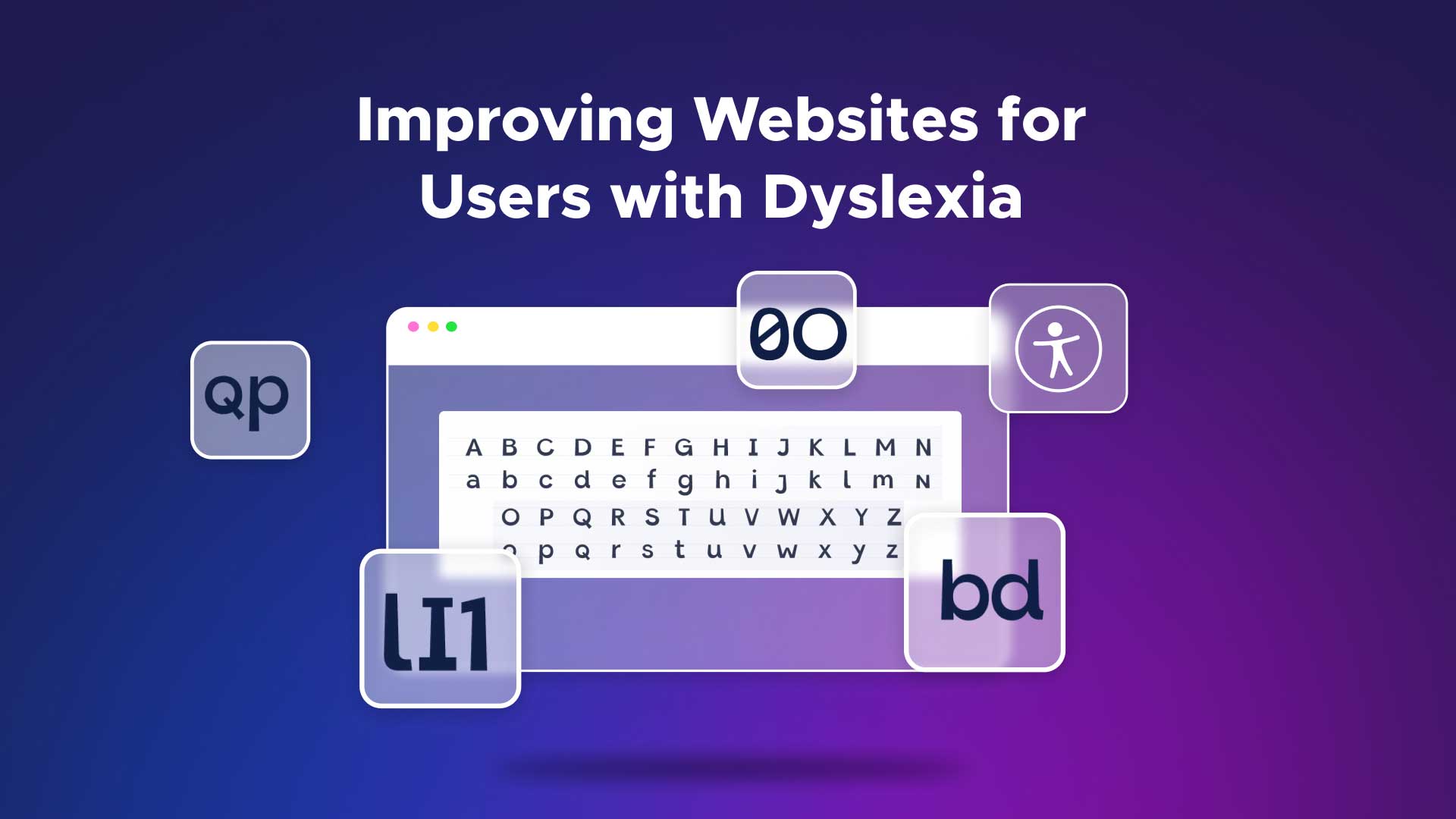
Making content more accessible for users with dyslexia
Just making two simple changes can vastly improve the reading experience for users with dyslexia:
- Make text left-aligned (not fully justified)
- Use a sans-serif font
Fully justified text looks tidy and professional on a page at a glance. Unfortunately, to achieve even left and right margins, uneven amounts of space must be added between words. Irregular spacing between words can cause complications for site visitors with dyslexia. In contrast, left-aligned text — which leaves the right margin ragged but provides even spacing between words — can be enormously helpful.
Font choice also affects users with dyslexia. Although there have been attempts to develop fonts specifically for users with dyslexia, the results have been inconclusive thus far. Instead, the kindest font choices are sans-serif fonts. Arial, Verdana, Helvetica, and other sans-serif fonts are cleaner in appearance and make reading easier for users with dyslexia, especially when reading from backlit screens as opposed to reading something on paper.
Giving users options
Unfortunately, font choice is right up there with color scheme when it comes to touchy issues when designing a website. Branding experts and marketing staff often have a lot to say about font choice and are more concerned with “pizzazz” and “personality” than with accessibility.
Fortunately, even if your hands are tied when it comes to font selection for a site, there’s a way to make your website friendlier to users with dyslexia. The UserWay widget allows you to display whatever font your marketing team wants, but offers users the ability to change to alternative fonts, including fonts better for users with dyslexia.
When installed on a site — with no code changes required, by the way — the UserWay widget offers a feature called Legible Fonts. It will change the display font on your site to alternatives that are more legible for users with dyslexia. The widget also offers options to enlarge the text, highlight links, and make other changes that might also give users with dyslexia a better experience.
Other formatting concerns
Additional steps that you can take with your content to make it friendlier for users with dyslexia include:
- Limiting the use of italics, underlining, and all caps.
- Breaking up text to add white space and avoid large blocks.
- Conveying information through infographics or videos instead of through lengthy text descriptions (when possible and appropriate).
A strange thing happened on the way to making a site more dyslexia-friendly…
The steps mentioned above come with a bonus. There’s another small group of users who will also benefit from each of these changes. The name of that group is “everyone.”
Virtually all users find left-aligned text in a sans-serif font easier to read. Virtually all users find excessive italics, underlining, and all caps harder to read and engage more deeply with infographics and multimedia such as videos. As often happens with accessibility work, changes made to benefit users with disabilities make the user experience better for everyone else, too.
Screen reader friendliness isn’t just for blind users
One other note: it’s not only blind or visually impaired users who make use of screen readers. Users with severe dyslexia also use screen readers for text content more often than you might think. So, making changes to sites to increase friendliness for screen reader users actually benefits a greater number of people than you may have realized and makes the effort that much more worthwhile.


Share