

Color Contrast Checker
Reading content on a site with similar text, background, and UI colors is challenging. And it’s particularly challenging for people with vision-related disabilities. Sample normal text sizes, large text sizes, and non-text elements to see your WCAG compliance results with UserWay's Contrast Checker.


Contrast Ratio
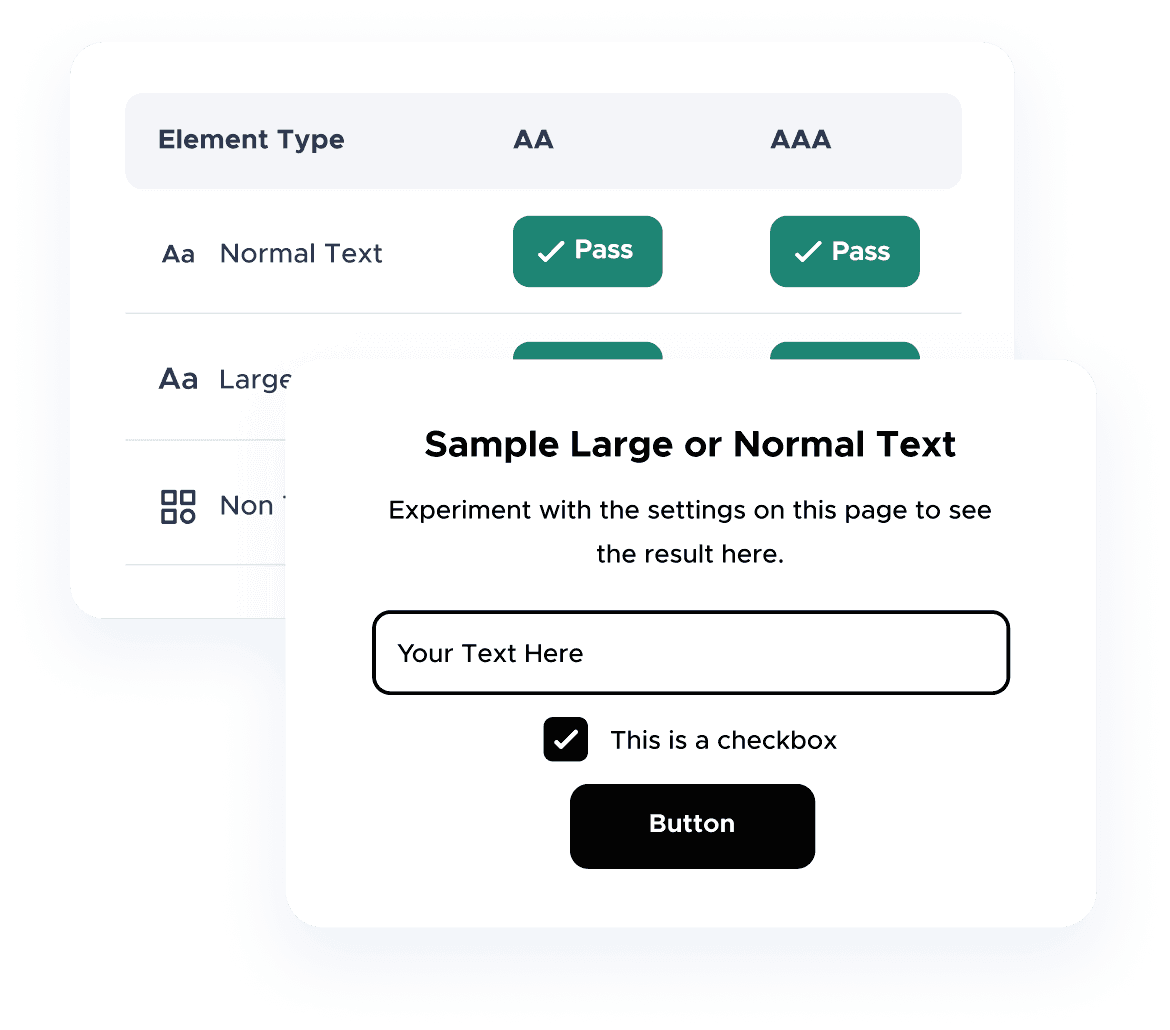
WCAG Compliance Results
 Pass
Pass
Sample Large Text
Sample normal text. Experiment with the settings on this page to see the result here.
How Does the Contrast Checker Work?
Test Your Color Scheme
- Input your foreground and background color values into the Color Contrast Checker below
- Look at your results under “Contrast Ratio”
- Click the “Share Results” link to let others know how your colors tested


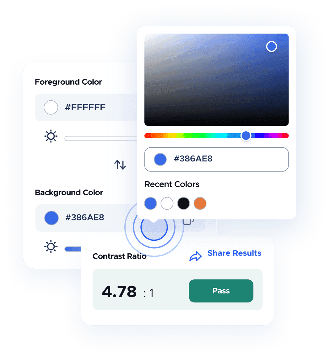
Find out if your texts are WCAG-compliant
Check your site content for AA and AAA color contrast requirements, which is the highest accessibility status you can reach. You must first achieve an AA level to meet AAA, which has the strictest color contrast standards.


The Importance of a
Color Contrast Checker
Color Impacts Accessibility - Not Just Design
It’s easy to think of a website’s color scheme as strictly a layout design strategy. But color is also essential to making your website accessible, especially to people with various visual impairments. For example, specific vision disabilities affect how people see colors.



WCAG - The Best Way to Check Color Compliance
That said, your color spectrum should accommodate these multiple levels of color perception. Of course, it's crucial to take the guesswork out of digital accessibility, and the WCAG is your best resource for meeting compliance. It’s best to think of the online Color Contrast Checker as a WCAG color contrast checker.


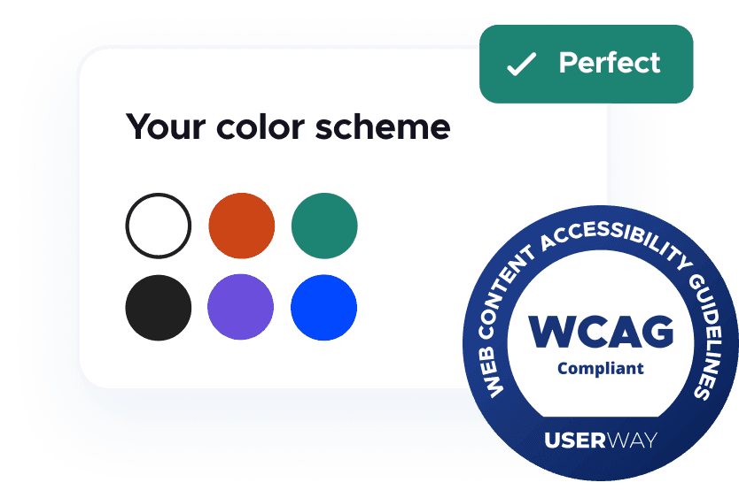
Three Proven Tips to Achieve Color Contrast Accessibility



Your Contrast Ratio Should Meet or Exceed 4.5:1
This ratio determines the contrast between brighter and darker screen colors and how they relate to the UI (User Interface). The first digit shows the level of bright colors, and the second shows the relative level of dark colors. This measurement is an excellent example of why a color contrast tester is such an essential tool for meeting WCAG compliance.
WCAG recommendation:
There should be at least a 4.5:1 ratio for content and UI variables.
Choose a Color Palette That’s Easy on the Eyes
First, choose colors for backgrounds, content elements, and UX elements, (e.g., buttons). And remember, particular colors convey specific emotions. For instance, green accentuates optimism, while red is often associated with negativity and even hazards or warnings. Another good rule of thumb? Maximum white space makes content easier to read for everyone.
Know Which Color Elements Are WCAG-Exempt
This tip can save your dev team a lot of time. WCAG color contrast requirements don’t apply to “look and feel” variables like a company logo or other secondary web page graphics. WCAG guidelines only apply to elements that all people need to understand and use on your website.
The following elements are exempt from these contrast guidelines:
Logotypes
Text that consists of a portion of a logo or brand name.
Incidental
Text and text images that:
- Are a portion of a dormant UI element
- Are strictly for decorative purposes
- Are invisible to end users
- Are one element in a picture with additional and substantial image content
Frequently Asked Questions
Here are some additional insights to help you reach your color contrast accessibility goals