When a site’s text or other elements are placed over a background whose color is not sufficiently differentiated from them, it’s challenging for anyone to read content and navigate the site. For people with visual disabilities, it presents a serious obstacle. Good color contrast levels are part of required WCAG and other standards compliance.
This step-by-step guide will walk you through our free contrast checker tool, showing you how to examine and test colors for any site, live or in the design phase. Find out if your site’s colors pass required minimum contrast levels.
Note: This is a free tool. No registration is required.
Step 1: Find your colors
If your site is already live, find the hexadecimal color codes for your site design.
Hex codes are number codes representing universal colors on the web. They start with a pound or hash sign, followed by six digits. For example, the hex code for black is #000000.
If you’ve used a designer to set up your site, you can ask them for your site’s specific color codes.
If not, check your HTML or CSS for all your site colors.
If you are setting up colors for a site that isn’t live yet, this is a great place to do it. Click the color picker and test your color combinations.
Now, mark down or save your color codes.
Step 2: Go to the color checker
This is a regular web page, so open a browser window.
Go to color contrast checker page.
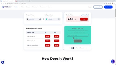
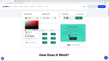
Step 3: Check your colors
Input your foreground and background color values.
Use the color picker, or directly paste your color values. You will immediately get your results.
Sample normal text sizes, large text sizes, and non-text elements to see your WCAG compliance results.

Step 4: Improve your color contrast
Choose colors that have a better color contrast ratio. Even a small change in color, like switching from dark gray to black text, can instantly make your site compliant with accessibility standards and legal regulations.
Step 5: Update your colors
You can change the colors yourself if you’re using a website content management system such as WordPress, Wix, or Shopify.
Or, you can send the results to a designer or developer to make changes.
To do that, click on the “Share results” text link. Type the email address and click on “Send”.
FAQ
Is there a way I can automate the color contrast process?
Yes, there is. Did you know that the FREE UserWay widget automatically flags color contrast issues that you need to fix? That’s a good way to cruise through large or complex sites without manually inputting all colors into the color contrast checker. This isn’t fully automated, but it is a tremendous step forward. Once you begin inputting your optimized color palette, your color changes will affect many areas of your site, creating a ripple effect.
How can I offer even better visibility on my site?
The free and Pro versions of the UserWay widget offer options for visually impaired users, as well as users with other disabilities. They can select a stronger high-contrast option, enhanced options for users with color blindness, enlarged text and images, and many other improvements that make navigating your site easier for everyone.
Can I tell everyone that our site is now accessible?
Fixing color contrast is a great starting point on your accessibility journey, but it is not the only change you’ll need to make to remove accessibility violations. Consider an accessibility audit that fits your company or organization’s size and needs.
Once you have completed the full audit process and made the necessary changes, you will be able to request a re-audit, after which the audit team will provide you with a VPAT or ACR. You can add an accessibility statement to your website as well.
What else should I do to make my site more accessible?
If you are concerned about other possible accessibility violations, installing UserWay’s widget and scanner will help you bring immediate and continuing improvement. These tools are useful for automated and semi-automated accessibility reinforcement, regardless of whether or not you choose to audit for accessibility at this time.